Video Installation Theory

(Image from)
Video installation is one of many variations regarding contemporary art. It combines flat two 2D images with 3D pieces of installation art (used to change the perception of space for artistic effect). To fully immerse an audience artists will harness all of the surrounding environments. This will include features such as room size, placement of projections, content of the projections and even visual aids will be used. Due to the rise in digital videography the technology is easily accessible to those willing to manipulate the hardware and software to create their artistic vision.
Due to the fact that all that is needed for this to work is a laptop, power supply and a projector means video installations are easy to set up. Allowing those more technically talented to create master pieces. As such you will commonly find video installations in all types of places ranging from an art gallery to a significant landmark. For it to be fully effective darkness is required. So for an art gallery no lights would be the solutions. Whereas outside installations will require it to be in the evening. Throughout this assignment I will be taking a look at some of the current and former video installation artists;breaking down how they use software and hardware for their artistic message. Alongside this will be my own comment and where possible those of critics.
Video installation is in every day life and we may not even notice it. Video installation is built upon the concept of projection mapping. Instead of using a projector to display a flat image. A series of projects/several outputs can be used to map a 2D image onto a 3D surface to create the illusion of depth and a 3D spacial awareness. The objects don't always have to be flat as in various software packages the projection can be meshed or even masked onto various surfaces. The surface color is usually one of those that reflects light yet any surface under no light can be used. Projection mapping is also known as spatial augmented reality.
This video by Projection Mapping Central is a great summary of what can be done with project mapping and where it is commonly found in the 21st century. The most common appearance is places such as museums which feature interactive elements, concerts and even in gaming. Before I go into the various artists I will go over how simple projection mapping can be how to do it.
(Image from)
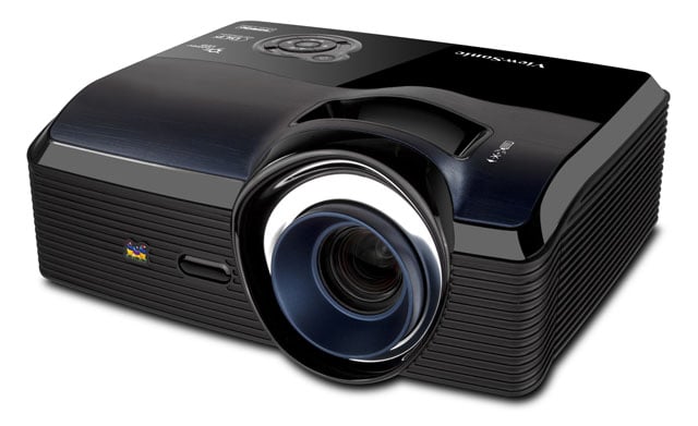
To start off you will need a projector, without this you loose the projection side of projection mapping. This is the key to having the surfaces appear on your select canvas. You will then need a canvas or an object to project onto. As you start mapping you will find it easier practicing on square surfaces before moving onto to more complex shapes. Once you have these find a space you can use that is large enough for the projector to fully project out. As you will be making the projects smaller or shaped to your surface using a laptop. Which is the next item needed for video mapping.

(Image from)
On the laptop you will need to install VPT7 (free software) or mad mapper (cost is required) as they are video mapping pieces of software. Connect the laptop to your projector using a HMDI cable and change the display settings so whatever is the output in the software is the one that is being projected. If we take VPT 7 for instance you will have two windows one which is the input and one which is the output. If you have the display correctly configured if you drag the output so that it is off the laptop screen it will display out of the projector. First off all in VPT create a new layer (+ sign in the top left of the screen). This will be noticed on the bottom right of the screen.

(Image from)
The menus along the top of the right hand side of the window are all of the sources. When a source is turned on, any layer that has that source selected, will begin playing.So if you wanted the media asset from source one you would change this in the layer settings. I.E Video1=source1. The software comes with preset assests ready to use. For each mapping start off using a chess background in order to get the lining up of the projection to the surface. As once you have created and assigned it to a layer you can change the shape of the projection to suit the surface. Once you have matched the chess background to the shape you can then change the output to your selection. In order to add in more assets you must get the file and place it into the file directory by going into applications and tracking it down. Once the assets are in the source folders reset the software for them to be loaded into the software. To best see this in a visual format this handy beginners quick guide by Youtube user Tinkernut goes over the basics:
I will now take a look into various installation artists to get an idea of what can be done in projection mapping not only in terms of technique but also content.
Video Installation Artists
The Creators Project
Box is a 5:15 minute video installation piece that was filmed for online distribution. It was created by The Creators Project. They are a global group who aim to celebrate creativity, arts and technology. The company came to light in 2009 and used Intel as a founding partner since they feature the work of "visionary artists" Alongside their official Youtube channel they also commission original artwork and perform at live events. The group itself is home to over 600 artists and houses big names such as Daft Punk and the recently deceased David Bowie.
The Box has 4 different panels with projections on each one. Each would come together at various configurations and explore different themes having animations cross between each panel to make it feel like one big picture. With the Box the group wanted to explore how the growing technology can be used in order to wow the audience. Taking the influence cinema first had on it's first audience. They wanted a physical world the audience could walk into and be amazed by it's levels of mystery. They also used it as an experiment to see how far they push a creative idea and current technology.
The group had always wanted to try video mapping and when one of the members had an interest in Robotics the idea to have a moving object alongside the projection came to life. With the overall concept pushing the bounds of illusion and magic. They took the simple tricks and converted them into a video. They started with transformation which showed the insides of the box changing depending on the way the box was "pushed" by the actor. This allowed them to create 3D objects and depth to a flat 2D surface.

(Image from)
The second was levitation. They transferred objects from one panel to another by having different animations projected onto the surfaces in a way which created continuity allowing the illusion to have full effect. Intersection, the third concept was having the canvas's go together and having the two together to create a depth and volume to simple shapes. Teleportation featured 3D shapes within the panel transferring to another. And finally they covered the idea of objects escaping their realms of spacial awareness.
They got a hold of two industrial robots which featured two lots of 8x4 canvas's. A dolly was then used to allow the real time animators to control the robots. They used a piece of software called Maya which allowed them to animate the canvas and matches it to an algorithm used by the team to tell the movement of the robot. They then used CG to create a flat render and mapped it onto the real life objects. This very technical installation required them to work out the moves of the robot first in order to judge how the panels formed a relationship. They needed to judge of it would look for canvas to go over each other so that animations featuring an object passing from another would work.
The team spent most of their time creating optical art to feature in the piece which was then created fully in Maya and matched to the movement of the robots. The biggest challenge the team faced was getting to understand the movement of the panels and how they would interact once in motion. Months was spent on figuring out the process. They made it into a film so that they could get their work online to get an audience talking. They wanted the camera to act as a spectator walking through the room and had motion capture set up in order to do so. They had someone walking around looking at the piece and then used this to robotic-ally have the camera move as if it was said person. The sound design was mainly the sound of the robotics but also digitally inserted afterwards. In the future the group are planing on having more practical installations rather then relying on CG.
(Image from)
I personally love this piece for the fact that is get's my mind fully immersed into the new augmented reality. When watching the BTS video and finding it out it was done with real time projection mapping I was even more impressed as not only did they managed to create these 3D effects with a 2D surface but it was also moving in real time as well. By having moving images on a canvas that is also moving not only takes it to the next level put also allows for the boundaries of video mapping to be pushed even further.
I also found it very interesting in the way an actor was also featured to be part of the piece as it was timed so well with the movements of the canvas's that it felt incredibly realistic to the point I began to question reality. The use of two canvas's also made it more artistic in the way the animations took place and that the two placed together really got me hooked into the 5 concepts of magic. It is clear the group is very intelligent and the fact it is the first video I have witnessed that has moving content also created sparks in my mind.
It would of been interesting to see if they could of created this in software such as MadMapper or even VPT7 to see if they would be capable of this. However, the fact they have created their own animations in Maya to be animated is also very impressive. The idea to also have the camera on robotics created a very fluent piece of art that not only impressed me on a content level but also on a technical level as it began to push the areas everyone else has either chosen to flee or haven't felt it was able to be done. The authentic ambiance of the background noises of the machinery also enhanced the nature and tone of the piece to which made you believe you where stood in front of the moving canvas. To which you can also take notes on the way they even made the viewing perspective from a persons point of view on a robotic system to match the content of the video.
Not only is it challenging those in the industry to try and out compete their idea it shows outsiders that may want to invest in this technology what can be done and how it can work for them. As online it has a massive audience to which you don't need to have a keen interest in video mapping to appreciate. Overall, the content and the technique of this piece have been very well thought out and makes for a piece that has a high impact.
Compared to other artists it was very illusion heavy which you don't see in every Video installation piece. For instance this is more for observing yet compare it to PERSPECTIVE LYRIQUE a piece by 1024 which relies on the input of the audience in order to allow the the overall piece to work to it's full effect. Since this is the first piece I have looked at the comparisons to the other artists is not as detailed as future sections. See later on in the assignment for more references to other artists.
1024

(Image from)
1024 architecture is a french company that was created by Pierre Schneider and Francois Wunschel. Like the company name suggests it is a video installation company that focus on creating outside project maps onto buildings. Unlike The Creative Project which focus's on pushing the boundaries on all types of mapping pushing the content rather than one form. 1024 use's buildings in order to create links between body,space, sound, low tech, high tech and art.
1024 also focus's on having a live audience witness their productions compared to The Creative Project which film theirs in advanced to have theirs digitally shared online gathered a crowd that way. Much like I mentioned earlier PERSPECTIVE LYRIQUE, a piece of theirs, focused on having the crowds input in order to fully harness their installation. In order to best understand their work I will look at a selection and break down what they intended to do and the techniques used. First of all let's take a deeper look at Perspective Lyrique.
This piece was one that was designed to be set up outside of the Grand Theater in 2010 in the city of Lyon during the feast of lights. The concept for this was to have an interactive device which based on the voice and the audience singing changed the visuals as the distortion was voice activated. The piece starts by having a continuous beat playing lighting up various parts of the building that have been mapped onto by using Mad Mapper. The flash's appear at various points around the building. When the song get's into the swing of things reality get's distorted and the building begins to fold in wards and stretched out to match the visuals. Which is another comparison to the creative project as they relied adding in sounds in post to match the animation and having the ambiance noise of the room. Where as 1024 use digital music which is played live alongside the projection. They also have the projection change shape using a loop created previously and then projected in mapping software.
After the introduction a 3D face emerges from the building to create the main piece , depending on the input of the audience depends on what the face would do. In order for it to be controlled by the audience the figure would change depending on what the input was. As the microphone fed the audio to an audio analysis algorithm. Which then changed the configuration of the speaking and eyes of the figure. Another key factor is that they heavily support using Mad Mapper as the main projection mapping piece of software.

(Image from)
Again they are also using very basic technology. Before the audience arrived they will have created the 3D render of the building and matched the mapping to the building so when it began the whole building was mapped ready for the audience to interact with. Alongside the pre-created 3D effects they needed to play everything in sync in order for the mapping to work. They would of also had to control what output was being fed. I.E the lights at the start would be one loop, the distortion mapping another and then the face as another layer.

(Image from)
MAD-Orb is an installation they created in 2013. Instead of having it as an experimental piece they use it for launch party/public event to amaze the crowd. Another recurring feature in their work is the use of DJ'ing music and is often played to the beat. For this they also created the shape in order for them to map onto their own custom shape. Mad-Mapper was also used as the key piece of software hence the name of the installation. Compared to the work of The Creative Project they have yet again mapped onto another stationary object and have often to have their digital DJ music to create a link between music and visuals. The idea for this project was first brought into light for the Mapping festival 2013 and was then scaled up for the launch party.

(Image from)
Finally, Digital Garden is a 2013 video installation that was featured in the city of Montpellier in the south of France. They decided to go back to their own artistic concept roots and links the history of the place which is a temporary visual garden in which vegetation takes support on the modern architecture and the new facades of the Art Center. The video takes a mix of the DJ music featured in their other work and also brings in the account of having various lights appear in the complete darkness. The use of digital music for the beats of the water adds an mysterious tone to which builds of a climax of plants taking over and reclaiming the space the architecture now holds. The music changes in tone to match the progression of the garden as it slowly goes from a place of wonder to one that is getting darker and darker and more over grown. A series of projectors where used to fully pan out the insides of the architecture and was once again featured using mad mapper.
Overall I am really impressed with what they are able to do with the technology the fact that par from the lyric installation the others harness a series of layers in Mad Mapper alongside live music in order to create their installations. The low end tech and the wonders they have created is truly impressive. Some of the work they have done could be replicated by myself on a basic scale but none to their level as it was been very well designed in not only the content but how the live music and the mapping fits together. The fact they use Mad Mapper (software similar to VPT 7 which we have so far used) truly shows that with careful thought and design acts of wonders can be created. And as we have saw two companies so far have created very different work using the same basic principles.
1024 aims to please an audience and takes on the more artistic and live events to be watched as entertainment which they do very well with the software and hardware I have explored so far. The Creative Project aims to not also please an audience but to make them question reality in the way the manipulate 2D plains in order to create optical illusions. Yet since they both use different methods in the way the content and mapping takes place yet both are equally impressive. When looking for reviews of their work one really stood out on digitalart.com. The quote " Their name defines their field of activity—between physical and digital architecture, 1024 corresponds to the standard resolution of a screen or video projector (1024 or 512x512 pixels)." The fact that a relatively new art form has lead to the pair having a reputation for being the name of their field; means that not only are they highly creative but they are acting as pioneers in their field. Not only does it match my thoughts in the way they are being very creative and effective it also creates inspiration.
They also note down that they bring new life into architecture that would otherwise be ignored. Which is vital for an architecture installation as it is not only meant to be known for its content but also where it was mapping onto. "The minimal graphic esthetics of 1024 are clearly influenced by the concept of lines and planes. Coming from the world of architectural representation, 1024’s radical and minimalist style consists of regulating markers and geometric constructive lines. Yet, depending on the project, our “Mad Mappers” will work on lighting design and experiment with the most expressionistic transformations of perception, such as for the Festival of Lights in Lyon, where Perspective lyrique consisted of breathing new life into the Théâtre des Célestins through exaggerated shadows and Frank Gehry-inspired distorsions."
Which is something I failed to notice in my thoughts, I acknowledged that they used the architecture for artist reason but failed to look deeper into the meaning of architectural mapping and why the use of buildings enhanced the work of the artist. Now that we have looked at this company I will now move onto another using the previous two companies as a point of comparison.
Bill Viola
(Image from)
Bill Viola (an American artist) is credited to be one of the world's leading contemporary artists in the field of video installations. He see's the use of video as vitally necessary; in terms of exploring his artistic concepts. For over 40 years he has created a variety of video work ranging from architectural videos, flat video and even pieces for TV broadcast. The majority of his work is displayed in galleries and museums and much like 1024 uses sound and the latest technology in order to immerse the audience into his ideas.
The recurring themes in his work revolve around the idea of human experience. So for instance he will often explore death, birth and the state of consciousness. Inter mingled with these concepts is roots in spiritual beliefs of Christianity and Buddhism. His main belief is that you must explore an idea with dualism. The concept that you can't understand what you are viewing without knowing what it is opposite to it. I.E light and dark. His work isn't as straightforward as 1024 and The Creative Project and will often make his videos abstract in a way that allows a person to view his work in their own personal way.
Instead of showing off a technique like Perspective Lyrique he uses the technology in order to create a message of artistic value by looking deeper into the video's concepts. As 1024 is more visually artistic compared to Bill's concepts. The Creator's Projects are also about the visual art. In the Box they explore the different forms of illusions and use it to create optical art. Bill Viola is more of a abstract artist and uses mainly a flat 2D video with the content being the artistic value. His work is often collaborative with his wife Kira Perov. With workpieces that have been shown all around the globe. Now that we know the basics of Bill. Let's dig deeper into his work. For this I will be looking at two of his pieces. One from 2014 and one from 2008.
One of Bill's latest installations Martyrs explore the Christian notion of martyrdom against the concept of the four different elements. Earth, Air, Fire and Water. Unlike the other work we have explored this piece was shown on four different monitors in the cathedral of St Paul's. The piece was silent but the sound in this youtube clip has been added by someone else. What is really interesting is the fact that he didn't projection map this piece but instead opted for a monitor in order to get the highest quality image for his work. For his other pieces of gallery work the use of projection mapping is often seen but for this piece it isn't present.
When it came to looking at reviews for this piece the Guardian has a header that starts to give an insight into what others think of his work. "Bill Viola's mesmerising new video installation at St Paul's Cathedral should silence his critics". It is very clear that Bill is more of traditional artist which is a large contrast compared to previous artists. 1024 and The Creators Project have took off with the online audience via Vimeo and Youtube. Creating work for the general public to which visually enjoy their work. As it was difficult to find critic work for their pieces. Whereas it seems that Bills work is very subjective in the world of art critique.
The review then goes on to praise the work of Bill as "an apotheosis is achieved simply through the combination of lighting, composition and expression, with the additional element of time. For all its advanced effects this is in some respects a most traditional work. Note: apotheosis is the theology of an idea that an individual or group has a divine level. What is also very interesting is that instead of using 3D animations and projected effects.
Bill Viola opts to film content for his projections/installations in order to tell his story. Which is something that hasn't cropped up so far in my research. Allowing him to physical film these concepts also shows his creative side in his filming and directing. As it is often easier to create abstract ideas using digital animation. Rather than trying to create abstract in reality. I love this piece not only for the fact that is aims to go for content rather than technique. The concept is a very unique one that visually pleases the eye. The four different elements also bring in the tone of the piece and all work together to form the overall ideology.
Although like the other videos it is noted that his work is "visually mesmerising" and further tells me that it doesn't matter what media you use. You can still get something that tells the concept you want to explore and still make it visually pleasing. Whether it is projection mapping or filming something and displaying it on monitors in a location. Now that I have explored Martyrs I will now look at another example. I will not be having separate paragraphs for my thoughts in this section due to the fact I have been lacing it in throughout.
Acceptance is a 2008 (note it contains nudity) piece that was projection mapped onto a black surface but kept in a flat surface and not warped around a 3D piece. It also doesn't aim to create 3D effects by having optical animations like The Creative Project. But instead shows a woman emerging from what first looks like a waterfall yet as the piece goes on it is as if the water is emerging from herself yet it changes to drop over her head and then drops behind her. The piece definitely shows of Bills Dualism not only in the fact that the light is the art piece itself matched alongside a dark background. But also the idea that this figure appears after being out of focus and in the dark to showing off the main piece in the light and clearly in focus.
The piece for me also shows that the water is a barrier. At first is stopping us from the seeing straight through to see the women, it then stops her from seeing an audience and looking forward to ending the piece with her not being able to move backwards into the water stream. Yet when the water completely goes she is naked and gives off a vibe to her vulnerability. Isolated the dark with no one or thing around her. The piece was also part of an overall group entitled "Bodies of Light" When rated by critics the group received 3 stars by Timeout . Acceptance was still praised, in the way that the motion and the images came together to form a mesmerizing effect: "Acceptance combines fluid slow motion with crystalline black-and-white images to mesmerizing effect.".
What can also be taken away from this piece is the idea of being reborn in a religious light. Yet because the piece is so obscure it allows the audience to think of a variety of different meanings. Which is one of the fundamental concepts of art. As each person's deception on what is art is different depending on their taste and ideology. The fact that Bill opts to go for concepts and ideas in the form of video explores more soviet montage. Whilst it varies from the work of 1024 and the Creative Project which are more digital doesn't mean his work is greater/worse. As the artistic value of each piece is dependent on the viewer.
Oskar and Gaspar

(Image from)
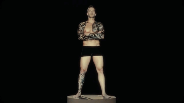
Moving back to the projection mapping side of things, Oskar & Gaspar is a collection of visual artists that use the body for projection mapping. Also named after the Portuguese twins Oskar & Gaspar. They aim to "surprise and overwhelm the audience, with innovative solutions, creating a knock-out effect!". Unlike Bill Viola who aims to use video pieces to tell his story, Oskar & Gaspar follow the trends of 1024 and The Creators Project. Not only in the sense of using video mapping software but by also having their unique use of the art. 1024 specialise in architectural which they do really really well. The Creators Project aim to push the boundaries in the space of a projection much like the Box which focused on having illusions created by having a moving animation on a moving 2D plane.
The group started in the year 2011 and have specialized in mapping onto tattoo's and people's faces (the person's eyes are closed so they are not blinded). With the idea of enhancing something that already physically exists. The art of projection mapping onto a tattoo is also known as ink mapping. The tattoos are used as the base and then in projection mapping software are mapped using individual layers to build up a completed piece. To create even more wonder they created all of the mapping live so that no post production is used which is very impressive.
(Image from)
If you take someone like the Creators Project who managed to create a very impressive piece. Yet theirs was pre recorded and all the animation was done before hand in a way that the robotics could take over. Oskar and Gaspar take it to the next level and work with what they have in front of them and shoot everything in live action which is not only to a higher standard. But it also goes to show that in the text couple of years if you can already live action map onto a human body. Then anything will be possible given the improvement of technology and the level of skill of those in the field.
The fact that these artists are able to enhance an existing piece of art to the stem that it is now animated. Not only surpasis my expecations from my research but also blows me away with what you are able to do with a projection and a piece of mapping software. The fact that the simple low tech can be used to create visual wonder not only shows the money making side of this art form. But the level of sophistication on such low kit makes me excited to see what is going to appear of the next couple of years. Especially for live events. As the main lesson Oskar & Gaspar has taught me is that stunning pieces of mapping can be created in live action, in this new found reality.
Whilst they are being just as creative as all of the previous artists the use of a functioning human which could easily move or change position. Brings an extra level of wow factor to their work. 1024 don't have to worry about their buildings moving or sneezing to alter their map. The Creators Project didn't have to worry if their human messed up the choreography as they could shoot another take. Yet also in the fact that the majority of their work was all under robot control. It seems that Oskar & Gaspar have took the root for making it complicated. Which in the end has paid off on the level of artistic skill. To best summarise this team of people I will now look at some of their biggest pieces of work to finish off my research.
In 2015 Lisbon held the first live tattoo video mapping event. Oskar & Gaspar created and produced all of the content which can be seen in the video above. Within seconds of the video starting you can already see there is a basic projector being used for the output of the map. A model who is heavily tattoo's then stands in black briefs so that they fade into the background and all of the focus is on the animated tattoos. Using a Mac Book (much like we use) they begin to map the figure in front of a live audience.
They even go to extra efforts to then go for the back of the body and even the tattoos on his feet. A series of other models are then shown having their tattoos digitally distorted and even brought to live as if they were cartoons. In one case a dove is animated so that it not only lights up but they flys across the body forming a trail across the chest. In one close up their is a piece of projection mapping software on screen but it does not looking like VPT 7 so my guess is Mad Mapper of even one I am not aware off. Overall this piece is truly great and matches my breakdown of the group earlier one. I will now take one look at a final example before breaking down another artist.
In this video which was sponsored by technology giant Samsung, the group projects onto a human face and animates/distorts the perception of a human. To start off with they completely cover the face in a white/grey coating so that it reflects the light. They then refine the eyebrows and hair using grey powder so that the features still stand out. Again simple tech is used in order to begin the process of projection mapping. A green screen is used for the background so not only can they digitally alter his face but also match/use the background to their advantage. As the piece goes on they change various features such as adding white glasses. Which in turn is used to give the illusion they are taking a photo of a person at the beach.
The use of the glasses also allowed them to map on a variety of different eyes to create new faces out of one. The final set of eyes are his own and when he takes off the glasses they still match his face. They are even so realistic you forget that he has his eyes closed so that he isn't blinded. They then go through a spell of different maps to create surreal looks to the face such as having a spider man esk face, a golden reflection and even stone. 3D shapes then appear on his face and appear to fall off as if they were real. In one instance a series of letters explode from a cube.
Alongside the face his body is also mapped and used as a silhouette at times. Due to the dark background they completely mapped the body so that no human features could be identified. A block map then kept changing the surface until it exploded and disintegrated as if the human had dissapeared yet he was still sat in the same place. Creating the perfect illusions and art from low technology and a couple of great minds. As the video goes on the group tries even more ideas and truly shows off what can be done with the kit. For my thoughts and comparisons please see my earlier work.
Sober Industries

(Image from)
This group of artists are different than the rest we have looked at so far. This is due to the fact that they operate by not looking mainly at the artistic aspects but by operating on a commercial level. They create video installations using projection mapping for working clients. Because of the way it can be used to amaze audiences big companies pay Sober to sell their new product using this new medium. It surprises me that I didn't come across more companies like this as for every new technology there is always some one trying to commercialize it for profit. Which can start a large debate in the meaning of is it still for artistic purpose if you aim to sell it for profit. By using projection mapping not only are they pleasing the company but also the audience who thinks its the best thing they have ever seen.
In terms of my stand point I am all for someone trying to make a business out of this medium. As other industries such as TV,Film and Radio all have these aspects and keeps the technology and work flow constantly improving with the cash flow. But to best understand this company I will now break down who they are and what work they do whilst also comparing their technique to previous artists.
Sober specializes in designing and producing communication tools to trigger the participants emotions. They aim to innovate through the use of light technology through the use of projection mapping. Working with clients such as Disney Channel, H&M and MTV. For a first my first example is through images.


(Image from)
During the Welcome to the Future installation event in 2011, Sober installed a series of wooden sculptures at their event which is the first artist which has taken an outdoor space and added to it to map. As 1024 projection mapped onto existing buildings, The Creators Project did install some features but inside a large hanger. To which there was no live audience present. There was also Bill Viola who had monitors inside St Paul's which didn't really take much to do compared to having these amazing sculptures created. What amazes me is that they designed it perfectly for their use and could easily design what was going onto the creatures in advanced. They could also practice in a space of their own the distances needed so when they turned up to the event; they could set up all of the creatures and line it up with the software already loaded. Meaning they can turn up and install the piece in minutes rather than creating it on the spot.
To allow the audience to interact with the piece they even installed a motion sensor which was effected by tilt. This also allowed the audience to change the light patterns to make it even more of their control. This is something I love,the fact that the audience can be involved in a work piece and feel like they are doing something making art for all instead of select minds. Whilst I also appreciate the fact that installations in general can be viewed by all audiences and that each piece suits different audiences. The interaction allows the artist to have more of a connection with the audience as it makes it more memorable for those involved.
The software is also very basic and like the others used. VPT7 could of easily been used for this piece of software and the hardware is nothing but a projector and a laptop. Whilst they also designed some great sculptures with some practice this is something I feel like I could do one day with some project. They will have designed their own animations to put in as a video loop and the sensors used does add more level of difficulty. But with some practice adding in extensions for inputs (such as the way you can use a VPT audio level output to map onto surfaces ) and some practice in animation I could easily be on my way.
Whilst it looks like they aim more to please a crowd then have a deeper artistic meaning like Bill Violas Martyr it still stands as its own piece. Again 1024 gardens piece is both visually pleasing but also very clearly harnesses a deeper meaning. It also touches upon elements of the Creators Projection illusions by having the various different shapes been built up to create one creature. I will now take a look at another two examples give my thoughts and opinions and then move on.
What is also becoming more apparent is that Sober specialize in mixing sculpture art with projection mapping giving them their own unique area. Such as 1024 focusing on architecture, The Creators Project look at concepts, Bill Viola goes for video installations around the concept of Human Nature and Oskar and Gasper focus on the Human face. Which is interesting as a lot of things Oskar and Gasper were doing to the face appears in this client piece for F1. As they take something from reality and turn the perception around to make the audience question what they are seeing.
In this sense this is done by having a team of builders assemble the model which they will have carefully designed and made. They will then set up the laptop and projector and begin mapping away by creating various different layers. For instance the wheel will be one layer, the panels on the side will each be individual layers and so on. Once all the layers are complied it then begins to make sense as a whole piece. The fact that something so simple has been well design means the piece flows as a whole. The animations feature in the video will have been free made and then edited in a way so that they loop.
Much like The Creators Project, Sober records all of their pieces and then posts it on the internet. Yet they will occasionally do the live events like we saw earlier touching on the aspects of 1024. Yet they haven't done gallery pieces such as Bill Viola. I like the way they work by making their own items to project on which allow them to maximize their creativity. The main wow factor to this piece is the idea that it is all well timed and designed. The different lines are all mapped individually and fit perfectly the create something that looks like it is real yet turn the lights off and its just a model. I love their style which is becoming more and more apparent in their work. The use of the different flashing colors and use of lines create a depth that really makes their model shine from using simple projection software. It is truly inspiring.

The final piece is a test piece they were trialing before moving on to bigger and larger models. See link under image. This confirms they like to use sculptures for their means of mapping as it has appeared in 3 consecutive videos and their Vimeo channel is filled to the brim with these types of maps. This time the models are made out of paper. Which is something I could look at doing in the future for my own work as this is showing how simple and basic hardware can create pieces of wonder.
They again break down the model in a series of chunks and use lines to defer between the different panels. Which alludes to the sense that they create all the layers and duplicate the video feeds for several of them. So when they all loop it forms an illusion and looks like it is glowing along the whole body of the bear. The lines are also then separately mapped and the colors of the glowing panels change to create different effects. Overall I am very impressed with their work and gives me an insight to how basic items can create pieces of wonder. Not only for yourself but then making a business of the back end.
Drive Productions

(Image from)
Whilst on the track of looking at commercial artists, I came across Drive Productions.Instantly from the look of their work they have higher level of productions compared to Sober Industries. They work with bigger name clients such as Adidas, Nokia, Tesco and even the G20 summits. With the aim of using the latest tech to "innovate and make unique brand experiences" making it an occasion to remember. Unlike Sober they aim to full submerse the whole space to their experience often taking up whole buildings and spaces for one projection. Their themes are close to 1024 where they take over spaces to show off their pieces to audiences.
They are that well known that famous celebrities will often talk about their work for an event where they were launching a power station in Battersea Jonathan Ross was quoted: "They've made Battersea Power Station look the way it should do. It looks like a nightclub from the future." They have even made strong links with bands for lives events so much so Ronan Keating doesn't "even need to question it. I don't even have to look at it, I trust them so much" Performers are even asking for Drive to work with them again and put on new events "projection map the pyramids in Egypt... and do a two hour show there... now THAT would be epic". Already without having to look at their work the fact that these people are aware of what it can do and that they want to work with Drive again. Suggests they are doing something right in the world of video projections.
Drive also look at completing experimental pieces alongside events and content for clients but to best understand their visual projection work let's take a look at some of their well known pieces. Such as Battersea power station:
Much like The Creator Project the piece aims to manipulate the planes of reality to form a 3D illusion but this time on a grander scale. This is to the scales of the work of 1024 and aims to be big and bold in the way in which it is to be viewed. Alongside being filmed famous celebrities were invited as guests which also got the word out about the group. This was released in 2014 and the video starts by having the projection of the doors being opened to reveal the factory. Parts of the wall then break away and slide to the sides as if it is falling apart. The most advanced part of this simple projection is the level of depth the group goes to, to create the animations. As they are created on such a fashion that works to form the illusion of 3D.
The actual mapping itself is one layer across the base of the power station and them two layers for the chimneys which played in turn fit together to form the overall piece. Which is not only visually stunning but also very effective using the simple hardware. As the piece goes on components from the top two layers fall down as if as one animation and passes them along like a cog. Hence the factory design. The music goes together with the piece in a way which feels like clockwork and is very efficient in synchronizing the two to form harmony instead of having music for the sake of it.
Layers that aren't animation are pieces of flashing light that appears at the side of the power station which in turn match with the sounds and visuals of the main animation in supporting its design. It then gets even more complex when the animation rotates creating the illusion that the real wall is moving yet the surfaces have stayed the same. Creating a really well thought out video installation piece that is fantastic. To top it off 3D visuals then appear on what already feels like a great level of depth and really gets the audience question what is reality.
When viewed from a distance not only is the whole building illuminated but it looks visually stunning to a level that matches and if not tops the previous artist's I've looked at. Lights are also projected away from the building to give a sense it is coming from this power station and truly attracts a crowd. The 4 minute piece then forms all sorts of new illusions to a gaming system, to the idea of superhero's fighting on the roof tops to motor cycle stunts and a larger music playing system. The fact that they can do so much with one space and all builds up to the logo of the power station not only ends on a great piece. But is very inspirational in what they are doing with the technology in that it hasn't been around for all that long and already great piece of art are coming out. I will now look at two other pieces giving my thoughts and opinions whilst also comparing them to other artists.
The piece starts by cutting from a pre-tapped video straight to the event which blends into the video. As the video begins to rotate and the sounds of F1 cars play the video installation piece begins. Red lines appear with the energy meters in the background and revs to suggest the car is beginning to start up. Which is already creating an immersive environment to which gets the audience hyped about the rest of the event. Keeping the audience in suspense making it really entertaining through creative use of hardware and software.
As the racing noises kick in and videos of a race track appears the lines on the car are mapped so that it matches the aerodynamics of the car. Slowly building up the details of the car. There are constant cuts to animated videos which end linking back to the projection carrying on the installation. Although there is one criticisms I have for this piece the actual animated videos and pre roll tape do more of the showing off of the product that the actual projection. In terms of content lines and circles flash around the car matching the beat to the music which in terms becomes pointless pre amble music that takes away from the installation.
Whilst the thought was their it took away from the elements that made Sober's video using the model of an F1 great and instead focused on an overall event instead of the installation itself. Although it has been one of the weaker projections the actual facts and client basis's was very impressive. Yet it needed to have more of the Battersea vibe to it in order to amaze an audience and immerse them fully. But to best get an overall idea of their work lets take a one last video.
The actual mapping itself is one layer across the base of the power station and them two layers for the chimneys which played in turn fit together to form the overall piece. Which is not only visually stunning but also very effective using the simple hardware. As the piece goes on components from the top two layers fall down as if as one animation and passes them along like a cog. Hence the factory design. The music goes together with the piece in a way which feels like clockwork and is very efficient in synchronizing the two to form harmony instead of having music for the sake of it.
Layers that aren't animation are pieces of flashing light that appears at the side of the power station which in turn match with the sounds and visuals of the main animation in supporting its design. It then gets even more complex when the animation rotates creating the illusion that the real wall is moving yet the surfaces have stayed the same. Creating a really well thought out video installation piece that is fantastic. To top it off 3D visuals then appear on what already feels like a great level of depth and really gets the audience question what is reality.
When viewed from a distance not only is the whole building illuminated but it looks visually stunning to a level that matches and if not tops the previous artist's I've looked at. Lights are also projected away from the building to give a sense it is coming from this power station and truly attracts a crowd. The 4 minute piece then forms all sorts of new illusions to a gaming system, to the idea of superhero's fighting on the roof tops to motor cycle stunts and a larger music playing system. The fact that they can do so much with one space and all builds up to the logo of the power station not only ends on a great piece. But is very inspirational in what they are doing with the technology in that it hasn't been around for all that long and already great piece of art are coming out. I will now look at two other pieces giving my thoughts and opinions whilst also comparing them to other artists.
Drive have also been asked to do launch events for products such as Lotus's press event in 2013. They projection map onto a real F1 product instead of Sober who instead make a model. Drive also take advantage of the background and use it to build upon the projections. Sound is also incorporated into their work unlike Sober and perfectly matches the design and unraveling of the piece itself. The event was live broadcasted onto Sky Sports which is the first piece in my research so far that has been shown live not only on a broadcast but also to 120 partners and sponsors.
The piece starts by cutting from a pre-tapped video straight to the event which blends into the video. As the video begins to rotate and the sounds of F1 cars play the video installation piece begins. Red lines appear with the energy meters in the background and revs to suggest the car is beginning to start up. Which is already creating an immersive environment to which gets the audience hyped about the rest of the event. Keeping the audience in suspense making it really entertaining through creative use of hardware and software.
As the racing noises kick in and videos of a race track appears the lines on the car are mapped so that it matches the aerodynamics of the car. Slowly building up the details of the car. There are constant cuts to animated videos which end linking back to the projection carrying on the installation. Although there is one criticisms I have for this piece the actual animated videos and pre roll tape do more of the showing off of the product that the actual projection. In terms of content lines and circles flash around the car matching the beat to the music which in terms becomes pointless pre amble music that takes away from the installation.
Whilst the thought was their it took away from the elements that made Sober's video using the model of an F1 great and instead focused on an overall event instead of the installation itself. Although it has been one of the weaker projections the actual facts and client basis's was very impressive. Yet it needed to have more of the Battersea vibe to it in order to amaze an audience and immerse them fully. But to best get an overall idea of their work lets take a one last video.
Drive then came back with a bang and created a 20 minute opening using video installation to launch the G20 in Russia. This piece is the digital version of a firework ceremony. Pieces of projections were perfectly timed to a series of different musical tunes which were also played live by a musician on a piano. In front of the projection were a series of smoke fans to build upon the piece. The ending of the video had all the those attending the G20 being displayed via their flag. Not only is this perfect for a live audience to truly be blown away but not only the quality of the piece but also the quantity.
It was also filmed and put online, but the fact is it so amazing means it will have also been featured on the news and online on sites such as Reddit and trending on social media. Which is a great outlet for Drive productions to get noticed in the future. As the piece goes on there is different cuts to live performers on stage such as fire eaters and acrobatics to mix up the vibe of the video but their is always something being video mapped. For instance during a jazz performance of Lady Gaga's Born This Way the background changes from purple and red colors whilst strobe lights are being projected out towards the audience.
There is also more dedicated moments directly to the video installation with the on stage lighting matching the music and going with the projections. It is also one of the first pieces to incorporate the idea of other live performances going on at once and shows the great potential for live events in the future. Giving it a path to grow alongside firework displays and other well known events. This is one of the best pieces in terms of audience entertainment that I have witnessed as not only is it simple projections but the timing and planning of the event is done to a high level that pays off fantastically. Leaving a pleasant reputation making it one mainstream video installation artists who aim for entertainment rather than a direct artistic message such as Bill Viola who opts to explore a concept and aims for galleries rather than large public events. Or the Creators Project that just uses projection mapping to push an idea. I am very impressed with how they harnessed the basic software and hardware in a multi media platform and it was a joy to watch their work unfold.
Limelight Productions

(Image from)
This (Penultimate) group I am looking at goes by the name of Limelight Productions. The best way to describe this group is a mash up of the work of 1024 due to their architectural work and the way in which they map. They then also animate in the style of Drives, Battersea power station which suggests either they use the same animation software or they have both took inspiration from each other. Yet, finally they also aim to create 3D illusions much like the Creators Project aim to do. So by having all of these different elements shared by different artists they become their own piece of art.
On their website they state they are a "group of artists doing art projections". Who create different installations in public spaces using a high power projector and a laptop. They aim to create "monumental, colorful, precisely mapped artwork to give an unforgettable experience for all visitors". They also aim to have all of the work in a place where the original still stands. I.E mapping onto a building or wall and when the projector is turned off the wall goes back to normal as if nothing has happened. It seems that again, there is very low tech involved using a projector, laptop, animation software and then a video mapping software. It is all in the planning and the skill of those involved that make up the artist pieces.
To best understand this team lets take a look into their work.
Already there is massive comparisons to Drive and Sober industries by looking at this piece. Limelight are working with Audi to project on their new factory in Hungary. They create all the special moments of the last 19 years for Audi in Hungary and projected it alongside the factory. Where as sober had more of video playing alongside the projection in their press event and relied on the heavy beat of the music. This is one rectangular piece of projection mapping that uses the music to pick up the pace as the years go buy and relies more on the content than the display like Sobers work. It also doesn't have all of the bells and whistles attached like Drive's G20 event but it is still a very impressive use of the projection mapping software and kit.
Instead choosing to focus on the content like Bill Viola but in a way for displaying to an audience and not for deep artistic vision. In all honesty there has been more impressive pieces that I have looked at during my time analyzing these artists. Yet with the kit they have it is still impressive as all the needed was the animation to be mapped out using a laptop and a projector. In the future they could push the boundaries by going for a more speculative viewing experience and adding in more elements to further rally the enthusiasm of the audience like Drive Industries. There has been no comparisons to reviews for a while due to the fact it is very hard to find them for specific pieces and ones for people such as Bill Viola where easy to find due to the fact they are gallery artists.
Within the same year Limelight productions released this video. To which I will now eat my hat. As they have managed to step it up in terms of their content using the same techniques as before. The sunny side of jazz was created for the jazz weekend held in the Pec's Spring Festival in 2012 (Hungary, which infers they could possible be Hungarian and even been based there). The building they were protecting onto was a recently restored factory which became a cultural center. The music that carried and makes the whole projection work was composed by Mrs.Columbo someone they team up with for this piece.
Overall, this piece is very effective and perfectly creates 3D illusions much like the Creators Project. The most notable time this occurs is during time were the doors are moving backwards and forwards from within the tunnel. Creating the effect they are moving out of the building and back into it. Yet it is a simple light projection. Towards the end of the piece we also see a glimpse of 1024 perspective lyrique were the building mapping has been distorted and twisted out of shape yet the building is still intact. These methods and illusions really make their work stand out compared to the Audi event. With a projection piano which plays in time with the beat of the music.
You can also see the audience running up and along the projection having a fun interactive experience much like the previous artists. Often running alongside the projected piano as if they were playing. The start of the projection is also interesting as they have 3d illusions of all of the instruments and then they fly into the building all at once revealing several pianos. There is more depth to their work having several panels having different things going on at once. Windows open playing out the musical notes whilst there is animations of musical writing passing through the side of the building. I really love this piece for not only having a catchy background and a well thought out piece.
But it also shows them as artists. They create more factual and professional pieces for big name clients and then create their own pieces of art to enjoy for themselves. Which when I brought up the subject of artistic value vs money earlier. This group brings in the balance to the argument and makes you see how they can have fun making what they want alongside paid work to keep them going (much like the Coen Brothers type of filmography). They have perfectly met what they intended to do using their projector and animations. Which although a recurring method, each artist does something with it in their own way making it very unique and pleasant to watch. Which over time is only going to improve. I will now take a look at one last piece before covering my last artist/group.
This highlight reel of their work is more to get a sense of them as artist overall. You can clearly tell they aim to use architecture for artistic value. What is more noticeable is the music they chose to play alongside it is very techno much like 1024's style of musical choice. Further extended those comparisons. The first piece that features in their show reel is very similar to the Battersea power station in the way the animation changes direction and proportion to make it feel like sections of the building are moving. But also in the design. The gears and metal connections almost make it feel like Drive/Limelight are using the same animation.
Their second highlight is one like the Box by the Creators Project were intersections of panels alongside animations come together to change the perspective of time and space. They then go on to create ripple effects by having an animation replicating the building in tiny cubes. They then ripple the cubes as if the building is waving. Which is not only very simple to project but technically difficult. Making it clear the team know how to warp the audiences perspective of reality precisely and effectively. Which is a recurring theme. A theme that is very impressive and shows the dedication of all these artists who want to push the boat of this new field.
Other pieces of video installation building upon the animation idea and instead of having it all placed at once. The animation unravels to build the architecture. For instance in White Night it's as if panels of wood are coming out from the ground. To start creating a beautiful structure in front of the audience. Which upon completion is burning down and creates a narrative between a girl who is stuck at the top of the tower. By harnessing the basic techniques this group has managed to turn a very simple process into one that is a master piece. Or in fact several master pieces. Whilst I am still not as impressed as this group as I was by Drive. They very clearly know what they are doing and their intentions are clear the moment you watch one of their pieces.
Urban Projections
(Image from)
The final group of video artists I am looking at is Urban Projections. Who created projections on any objects as stated on their website: "objects, buildings stage design, people, architectural features, tin cans...... you name it. " Which compared to the other artists shows that they are willing to adapt to any circumstances to video map their art work. As so far each group has had some preferences over what they map onto. Yet overall they all do the same on a technical level. 1024 focus's on just buildings, The Creators Project is a man made installation, Sober Industries use models and Drive tends to do architectural but have dabbled in the odd car.
This group also focus on other types of installations, such as live visuals, street projections and digital graffiti. Which seems like they are more focus on creating pieces of art in all elements rather than specific preferences. These types of projects often change in the way they are technically carried out.
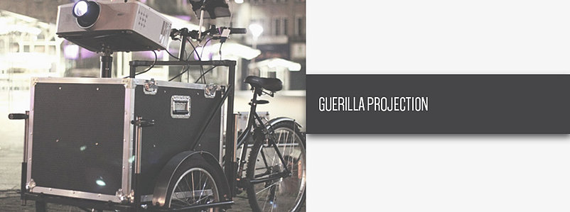
(Image from)
The group often uses a type of projection they call guerrilla. Where they have a portable power pack and projection out on the move and video bomb buildings from their custom bicycle. This is taking it one step further and going off rogue. Instead of planning to go to one location and map onto a set object to which they have been preparing for a long time. They instead go out and map freely as they please.
Which instead they opt to go for art this way instead of permanently writing on the wall. Which is a great replacement as it doesn't last there long and if the public don't like it. It can be gone with a flick of a power button. Allowing artists to freely give their artistic vision to the world on a small bicycle. Which is something I really like, not only can the group go out their and free range there ideas. It also makes it more unique for the audience as only those passing by will be able to see it. No pre plan date or time; live from when they chose to do so.

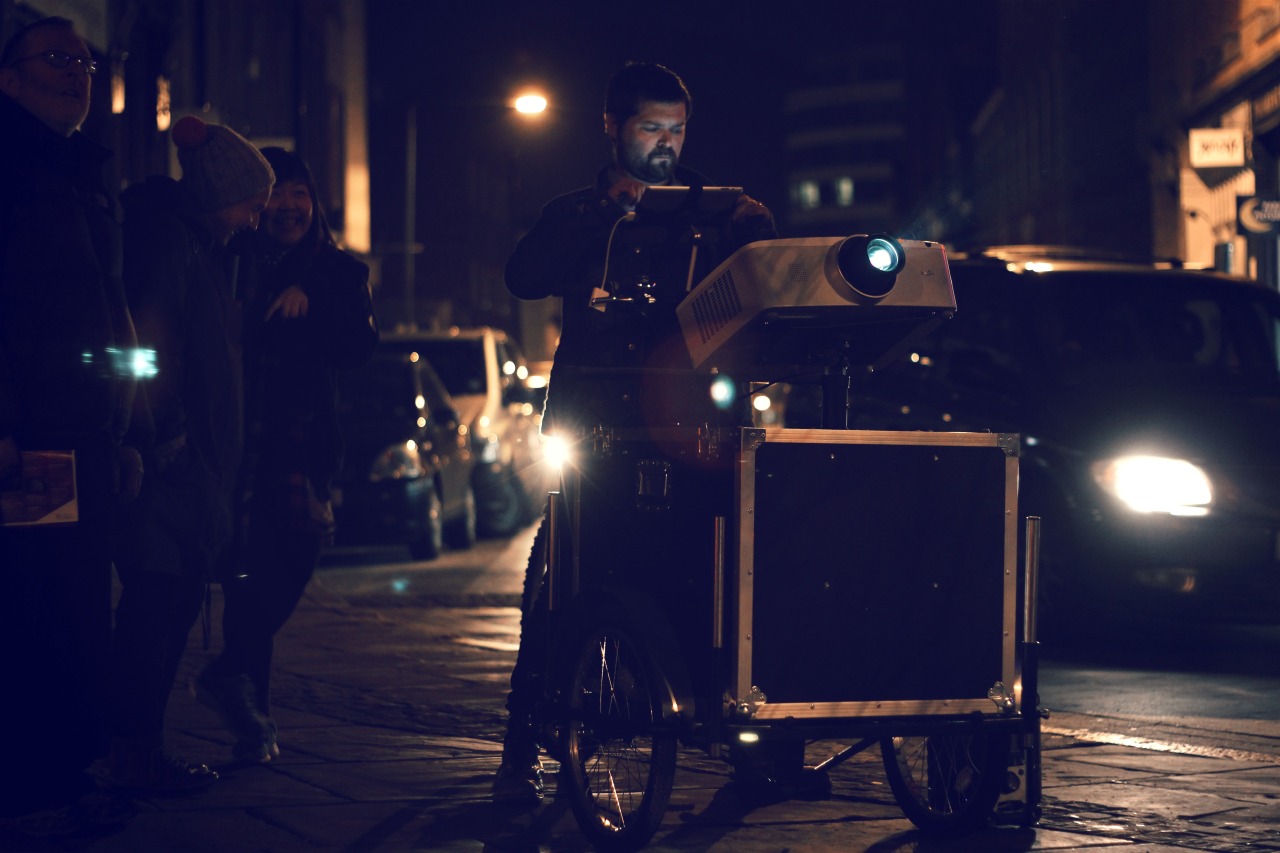
There was no video for this piece by Urban but this is the sort of things they went round mapping onto various components of Mansfield. By roaming the streets they placed various OFJAM maps to promote Oxfam. Yet they did it in an artistic way that doesn't feel like forced promotion. Instead they went round digitally bombing various buildings. They did it all with a high power projector, a macbook pro, sound system and then a battery pack. This very impressive and simple method not only made good use of public space but it also transformed disused areas for new artistic value. Which is not only a great use of the software. But the fact they could also do it live on the move shows that they have an extra level of skills.
They also have a blog about there system which they call "The Light Cycle" "The adventures of a bike with an imagination". Not only is this portable and allows them to map where-ever they like it also allows them to constantly develop new maps to show around new places. Treating each place like a different client. The cycle has been to places such as Chesterfield where they projection bombed Christmas maps for a live audience. It has even been to Nottingham. The mac book has also been replaced with an Ipad for some of their adventures using the touch screen to precisely control their maps. The cycle itself also gives a person exercise whilst creating art. One of the many features you would of predicted to come out of video installation. But never the less I am very intrigued by this form of video bombing and the spark for someone to think it could be done whilst incorporating movement.
(Image from)
This has been unique to Urban and so far the other artists haven't thought about having a live moving projection map. With the majority choosing to do live still events of even film it for purposes of digital distribution. Yet some companies have incorporated small time movements into their work such as The Creators Project who relied on having a robotic camera and cranes to move their maps in real time for artistic effect.
Urban Projections are their to provide opportunity to create projects and brands throughout the UK. So not only are they are large organisation than are constantly evolving with new tech and talent. They also take the chance to projection for artistic purposes but directors, dancers and big name clients will often come to them for events. Allowing them to get a commercial aspect out an art they enjoy. Because there is so many of them, there is then the chance to spread out into all these different form of projections.

(video link)
One of the client art pieces Urban Projections has done was for a promotion for the new Vauxhaul Adam. The car was placed in Merchant Square, Glasgow and the team alongside Dave Lynch and Lumen created a mapping for the whole of the car. They sound for the piece was played through the cars system and had a 7 channel audio mixer alongside an amplifier and a boot mounted subwoofer.
The fully submersed car has been one of the best mappings I have looked at. It was a lot better than Sober's mapping of the model F1 lotus. As all they had was a series of circles playing to the beat of the background video. Which didn't really harness the projection mapping software. When doing this Urban will have had a series of projectors to get the 360 vision and then synced up projections. As each quarter of the car will have been made up of various layers to cover the whole car. Carried to music played live with the car it perfectly surprised the crowd surrounding the car.
Crowds would pass by and take photos of the simple mapping. Yet when someone touched the car the alarms went off and the mapping sequence began. The touch sensitive system them altered the colors in time to the music. As more and more began to looked at the alarmed car. The sound stopped and the car turned all white. Giving the illusion it was powering down. Music then began playing from the car and the happy and joyful tune drew in more and more crowds. Various patterns and designs then began playing until it was all switched off to leave the car as it was meant to be.
When quoted in a online write up of the event the marketing director had said “The premise behind the Vauxhall Adam is that it has the freedom to change almost every detail. It’s about fun, surprise and reflecting your style, so the car is about setting trends and not following them. We wanted to catch people unaware and demonstrate a different, unexpected, fun side to the Vauxhall Adam.”. The fun side defiantly came out of this project as the bright colors and the patterns not only showed finesse in the technical standards as it was all controlled very well in various loops.
The synergy between the music and the projections also had the audience dancing alongside the car and made it to be a joyful customer interaction. The simple us of the software also allowed the message of the marketing (artistic value of the piece) to shine brightly and became very remember able. Unlike those of Sober industries who couldn't quite live up to this piece.

(Video link)
This last example was called "Bloom" and featured the team taking over a building to map live onto it. A graphics tablet was sued to create the animations and wrote the text bloom also doing so. This animations were then fed into a projection mapping piece of software that I was unfamiliar with. The various camera angles of the video show the different elements that they mapped onto the building.
They started off with an animation of the bricks falling down revealing a basic drawing of the building. A spot light was then projected and with the techo music (another link back to the Limelight and 1024 in the use of music alongside projections) to have the lights of the building flick on and off. The building then got a very surreal look to it and bright blues and pencil shading colors appeared. Alongside a smaller building below to be featured alongside the projection.
So far this isn't the best piece I have seen and takes a lot of repeatable moments witnessed in other projections. Yet it is still technically amazing based off a 2D image. The projection then goes into a drawing esk mode on post it notes and sketches. Yet it feels like it doesn't flow properly and is more of a mish mash to the music. Which personally I don't enjoy. Yet the time and effort , but most importantly talent put into this piece is something to appreciate. But falls behind on the architectural maps of those such as Drive, 1024 and Limelight productions.
Throughout this process I have found some truly inspiring artists all of which I will take into account when I will need to create an installation. I have enjoyed looking at the various components each artists use to create their pieces and then comparing them to other artists.
End of Assignment