Creating Media Products: Magazine Case Study

For this assignment I have been asked to look into two different magazines in order to understand how products are created, specifically towards certain target audiences. For my case studies I will be looking into the Top Gear Magazine and Empire. First of all I will break down the audience of Top Gear and then look how the codes and conventions in the content of the magazine are defined to their target audience. I will then do the same for Empire. After this I will look at both magazines together to understand how a producer uses audience feedback in order to improve future products.
Top Gear Magazine - Audience Profile
(Image from)
Top Gear magazine is a motoring magazine owned by BBC Worldwide, the main commercial aspect of the BBC(which means it can be published not only in the UK but also to external countries). BBC Worldwide hire Immediate Media Company to make sure the product get's published in the first place. Immediate Media have produced other work such as the newspaper the Radio Times, Good Food and even toddler television such as Bob The Builder and the Teletubbies. According to Immediate Media themselves all "profits are returned to the BBC and help fund new BBC programmes." In 2013, the magazine won motoring magazine of the year.

(Image from)
The magazine was named after the original run of Top Gear which first began in 1977 as a half hour motoring show. The original show lasted 24 years before it went off air in 2001. A year later the show was revamped to an hour programme with the trio of James May, Richard Hammond and the shows main host Jeremy Clarkson. The magazine though was launched in 1993. The mast head of every copy still uses the Top Gear programme style in the form of it's text. The aim of the magazine is to " deliver the very best stories about the world’s most important cars. We put the reader in the driving seat and take them on a journey, whether it’s helping them buy the right car or offering a dose of pure supercar escapism. Each issue features the world’s finest photography and writing, including opinion from Clarkson, Hammond and May, as well as honest, no-holds-barred judgments on every car that matters, plus a roundup of weird and wonderful motoring-related stories from around the globe" - Charlie Turner, Editor.
(Image from)
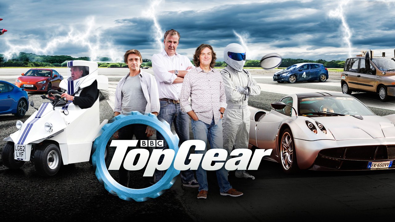
Like the quote states the opinions and columns in the magazine came from Clarkson, Hammond and May. This was true up until late last year after the three took leave from Top Gear due to a fracas between Jeremy Clarkson and his producer. For the terms of this assignment I will use examples of their columns as at the minute the new hosts do not currently contribute to the magazine. Other running gags in the magazine revolve around the Stig who is the expert racing driving used by the TV programme. It is available in shops, online and even on Tablet and Mobile.
Now that we have some background to the magazine lets breakdown the demographics and physcographics of the audience. Well first of all it is very close to the audience of the TV show, yet the magazine is more of factual piece compared to the entertainment and pace of the show. Which was once branded by the Telegraph as a show for "the people who have the mental age of 9". Yet let's take a look at the official demographics provided by Immediate Media.
First of all the main reach of the magazine is strong with 84% of those who read the magazine being male. This is mainly due to the fact that car's are often seen as a manly hobby and those who are extremely dedicated are known as petrol heads. The BBC take this stereotype and make sure to brand it as manly as there is a larger audience if they do so. The average age of the reader is 35. This doesn't mean all of the content is just for 35 year olds otherwise the magazine would be a very niche market. This means that the collected data shows the average of the audience. For a magazine like Top Gear you are looking at an age between 18-40. As you have all the ever day cars mixed in with the super cars to which young males inspire to own one day. Or bought as part of a mid life crisis since the magazine is aimed mainly towards the middle aged male variety. As again, it is another stereotype to which the BBC harness.
The magazine also has a reached of 1.6M which means that every month it is released at the price of £4.45 or 5 for £5 when you first start a subscription online, means that with every issue there is at least £5 million pounds return. Which over the course of the year adds up to around £60 million pounds of income for the BBC. In terms of circulation (average distributed on each day) Immediate have a figure of 130K which is very impressive. Note, this doesn't always mean the same as amount sold in a day.
(Image from)
Now lets take a look at the social grading the company has got as a target audience. All together the magazine has 55% of those in the ABC1 category which means there is an spread of people from upper middle class, middle class and lower middle class. And out of these 28% are AB. Which strongly shows that the magazine is ideally focused on the upper middle class and the middle class. Which brings together that the magazine is for the every dale male. Who spend an average of reading the magazine for 44 minutes.
In terms of location the magazine is mainly aimed at the UK with the slang and opinions used by the Top Gear hosts and the way in which the language is used. Adverts in the magazine (see later) are also related to UK car firms and local dealerships. So this is the locations primary audience. Yet because of the reputation of the show worldwide there is also a secondary audience for those outside the UK. So overall there is a target audience of Males aged 18-40 who live in the UK and are in the social grading of upper middle/middle class.

(Image from)
In terms of physcographics the best type of categories that lend themselves to this audience are; apsirers: Will seek status, excessively concerned about the acquisition of money, acquisitive, orientated to image and appearance. Typically younger people. Reformers: The last of the groups, is where they seek enlightenment, freedom of restrictions and feel the need for growth as an individual. They have a social awareness and have a good sense of independent judgement. They have a good taste but are anti-materialistic. They will often have a high level of education. This is often related to middle class as they aren't up spending tonnes of money on high quality fast products, but they are in the middle range. Take the company Volvo:
Whilst the Aspirers are aiming for super cars and the best brand products. This group will often go for the well made products. Volvo has a mid range level of cost in the car world. It is in the same range as Ford, Kia and Toyota. Through marketing they manage to show the quality of the products as in this particular advert a guy is standing between two Volvo trucks and he manages to maintain his balance. Information taken from previous assignment.
For this audience these two physcographics go hand in hand. In one group you are looking at the younger audiences who aspire to drive the fast super cars and have all the money to which often stays with some people all of their lives hence the mid life crisis of buying a new Porsche or other supercar. Or you have the reformers who are more of the petrol heads "relying heavily on cars and find them superior to other means of transport/car enthusiast" So they will often go through their cars just for the driving experience. The magazine does both of these by having the big flashy cars on the front for all the aspires and then the gritty in depth detail of the car inside the magazine for the more well educated reader who aims to discover more knowledge about the car to meet their hobbies and needs.
Top Gear Magazine - Content & Codes and Conventions
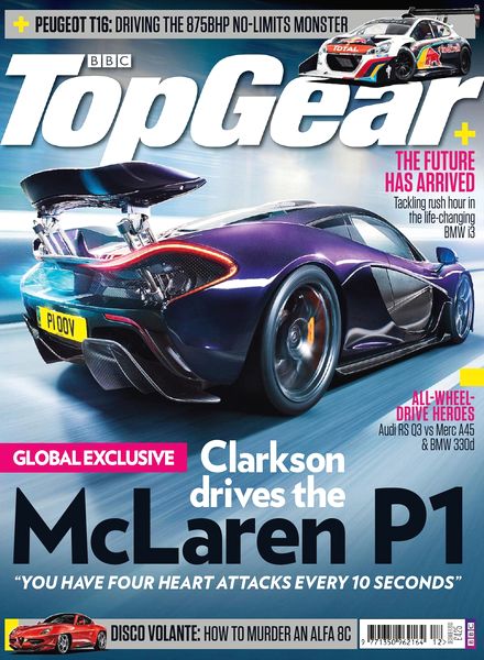
In order to understand how Top Gear use codes and conventions first let's see how the front page appeals to the target audience.

(Image from)
The Top Gear magazine is a monthly magazine much like Empire. It is also similar in the cost, as it costs you £4.25 (cheaper via subscription) this price is perfect for the middle class target audience as £4.25 is a good price for a magazine that you only need to purchase once a month. It also fits in a middle grounding of prices, in a similar way it is in the class system. If it was a weekly magazine and had the same cost then it may have a different target audience as instead of £4.25 a month it would be £17 a month which is x4 the normal costs.
The first thing to notice is that it is defiantly a car magazine which when we broke down the magazine earlier puts the audience to the magazine. As not only can young lads aspire to drive the latest Porchse. But the petrol heads are supplied with masses of information about cars. The use of the super cars also draws into the target audiences mind set of a fast car being the best car around. The use of the super cars also draws out the boy racer in the audience and makes them imagine life with one. In fact the magazine features three levels of depth each with different cars. They are also labelled and follow three big names in the motoring industry: Lamborghini, Porsche and Jaguar. The use of the race track also links the ideas that cars are meant for racing and having fun; to which draws to the mindsets of the target audience. As it is a males dream to spend hours driving fast cars, pulling stunts and tricks without nobody interrupting.
The header of the magazine also makes the audience read the magazine as they are receiving exclusive information about a new upcoming movie which is all about formula one racing. Which appeals to part of Top Gear's target audience. The idea of fast car racing is a hobby/viewing sport for members of the audience and the synergy between the two products allows the audience to find more outlets to what they enjoy. The audience is also treated to a "free Rush download for every reader" which top gear use as an incentive to draw the audience in.
The magazine also features previews to the magazines articles and leaves the audience wanting more. For instance the article about driving the 911 GT3 is teased with "The purest 911 yet? Time to find out" Car buffs will immediately want to read the article as it is an area than interests them as the facts and figures of car comparisons is something the target audience really enjoys. The previews also match the level of depth in the magazines layout we looked at earlier. Previews such as "RH unleashes his dark side" and "Stig defines the smoking ban" leave the audience intrigued and the only way to fix this is by reading the magazine. The use of slang when talking about the new Lamborghini also implies there is an established relationship between the audience and the reader. As slag is a common form of communication between close friends. A new elder reader might not understand who RH is and the use of the term HypoLambo will go over many peoples heads. So it appeals to the target audience by not only using slang but also using motoring jargon to which the audience understands as they have a vested interest.
Alongside an established magazine audience, the magazine also appeals to those of the TV show. As it uses elements and features from the show. For example the test driver "Stig" appears in the magazine doing a car test for the new Jaguar. And Richard Hammond one of the shows hosts appears on the front of the cover alongside doing articles for the magazine. To further create the synergy between the pair there is the Top Gear logo in the masthead which uses the same font and style as the show. And is also branded with the BBC logo. Which allows the magazine to also appeal to the audience of the TV show which is the same/slightly different to the magazine audience. And when we look deeper into the magazine later on we can see how the pair are linked even more.
Alongside the foot of the magazine there is also more incentives offering 3 more articles. Another link between the show is a feature with James May another host and follows him exploring a hatch back. Which isn't included on the front page center as that is more of a focus for the fast cars which appeals to more of the target audience than the hatchback does. There's also a preview for another type of motor racing - monster truck driving and there's an silly article about fun in the pub with a taxi driver. Which is used in order to bring out some male humor to entertain the audience after reading car jargon heavy reviews.
Above the footer is an intense quote that doesn't say who said it and what car it is referencing. It also has a title of "World first" the combination of "This feels more alive than anything I have ever driven" creates excitement for the target audience as they want to find out not only what the world exclusive is but what car it is and can they get their hands on it. By creating tension through previews and quotes the magazine can easily draw in the target audience as active readers like to try and see if the magazine answers their questions.
Finally, the use of the green is used not only to fit in with the rest of the page design but is also has that element of making it feel like a boy's child magazine. All because of the color yet the content of the magazine features car heavy elements; yet every now and again their is some male child like humor inserted by the Top Gear trio and the idea from the producers is that the audience is meant to feel like children again as they look back on nostalgia and imagine what it is like to dream of driving fast cars again like you would as a child using something like Hot Wheels or even a pretend steering wheel. By using little features like this the magazine can subliminally appeal to the target audience alongside using images. Now let's look at other features of the magazine.

One of the recurring features in Top Gear magazine is the car breakdown sheet. This is usually found at the end of the magazine where the main chunk of content ends. This is directly appealing to the target audience as it breaks down all the features you would expect to hear about as a petrol head.
This is more appealing to the older side of the target audience. Yet if there is a younger member of the audience who is car levy then this section also appeals to them. For instance in this magazine it is directly looking at the cars of Kia and Chevrolet; there is the model type in the blue lines and a small picture to show the audience what car it is breaking down. This becomes useful to the audience as if they knew the car but not the model then they have learnt something new (also vice versa). This part of the magazine is very formal and only tells the audience what they want to know in numerical form.
The main factors included in this breakdown are all car jargon heavy such as: The price, the emissions rate, fuel efficiency, horse power, rev's per minute, miles per gallon, ABS and cruise control. Because the audience is aimed at motoring fans, this guide is perfect for any enthusiasts, it also suites the audience if they where to buy a new car. Using the breakdown as a guide when reviewing a selection of motor-vehicles.

(Image from)

(Image from)

(Image from)
One interesting thing about the magazine is the constant adverts after every article. The adverts themselves are very suited to the target audience and help determine the fact even more. All the adverts are very car focused and look at new cars, accessories, fuel and car related products such as Ferrari watches. If the audience wasn't focused on motoring than why would advertisers waste time creating advertisements. They do so as they can share their message with an identical audience.
Take the first advert for instance, the audience will be interested in new tires as they will want the best for their car. Members of the audience may take the information on board and the next time their car goes in for a service or repair they may also replace the tires (if not already an error). After reading the magazine they may even buy the tires from the advert. The advert also doesn't say much and just leaves the specifications of the wheel sizes. The design of the advert does all the appealing to the audience.
The second advert is another car maintenance feature. This advert features more information and aims to appeal to the target audience who take great care in their car appearance. Aiming to prevent car scrapes and dents and tells the audience it only takes seconds to apply. "Prevents all minor drive-in impacts and door opening damage" They then leave the price in a glowing yellow circle to draw the audiences attention towards buying the product. The brand of Halfords also appears which is a regular advert before, during and after Top Gear on the channel Dave. So parts of the audience may already be aware of the branding and further synergy has been created again.
The last advert is appealing to the audience as it is encouraging them to get the most performance out of their fuel and to feel like racing champions. By using Mobil 1. The advert also shows all the success of Mobil 1. Encouraging the boy racing inside of the target audience to purchase the fuel to feel like a racing champion. So by looking at the way Top Gear accepts advertisers, as the audiences's appeal matches both products.

(Image from)
Like I mentioned earlier Top Gear like to appeal to the audience of the show. This feature does this perfectly and appeals to the child inside of the target audience. As it goes off magazines the audience will have read when they are younger. It also uses the concepts of cars and makes it more appealing to those who are not fully engaged. With the main appeal to the younger side of the target audience. For instance the title "Top Gear Toy Theatre" completely engages the audience and gets them to carry on with this feature.
The introduction also breaks down their view of the audience and create a product to feel like Top Gear is always on. "Where can the nation's car nuts turn for their Top Gear fix? It's a headache. But we've got the cure! Because with our fantastic FREE Top Gear Toy Theatre" The opening itself feels like one of those toy adverts the audience would watch as a kid and the language itself matches this tone and vibe "Simply cut out and assemble the elements as shown in the diagram, pop a Gordon Giltrap LP on the radiogram and let the show begin" Which to me doesn't make any sense but for the older generation they will understand perfectly. The model itself also appeals to the younger audience as they can play around with the cut outs without understanding the written words.
There is further synergy with the show when they break down the presenters and who they are "The Hamster is the pint sized action man of the show" "The Stig, the show's tame racing driver" "Captain Slow is a pipe and slippers man" and "Motormouth Jezza". Not only does it give a summary of everyone for new audiences but the language and the way they describe the trio is all too familiar to the target audience.
It also references the show in other elements for instance when introducing the audience section "Milling about uncomfortably" "One of the presenters may engage an audience member in a patronizing chat before sitting down to talk to Ewan McGregor" which is not only a reference to the audience in general but for when Ewan was on the shows "Star in a reasonably priced car" (which see's how fast celebrities drive in a reasonably priced car)
There is also lots of car jokes to appeal to the target audiences taste. This is commonly witnessed during the car cuts outs "Whether your reviewing a Ferrari Testarossa that you couldn't afford a spark plug for or laughing at a Nissan Micra". If this magazine wasn't for the target audience then the informal language and the way in which they use jokes wouldn't feature in the magazine. However, since they know perfectly who they aiming for it all works in the magazines codes and conventions. This is further clearly shown during The Banter section of the magazine. When you can cut out the celebrities heads and stick them onto a model. "Top Gear is all about ladish banter and unless you can talk the high octane talk , your show will fall flatter than a fiat battery on a snowy day".
Which sums up perfectly what Top Gear is trying to do. Give you the formal information about all the latest motoring news whilst also providing the audience with "Ladish Banter" which is why all the codes and conventions all fit into place. Other references such as "Flappy paddle gearbox" "We were each given £2000 and "on that bombshell" further harness the links between the magazine and the show.
Overall, this section works perfectly for fans of the show already, but the same target audience who have may never watched the show get a really good introduction to what the show is about from the informal slang language, the humor and the friendless of the written text. The images are also taken directly from the show to give new audiences something to look at when being introduced to new people. But the existing fans also appreciate the efforts.

(Image from)
Now lets move onto the first of one Top Gear host reviews. This one is reviewed by Jeremy Clarkson. The review itself mixes informal and formal language in order to get the information across. Other reviews in the magazine are more formal but this is a good mix for the audience to learn something new whilst also having a laugh. For instance the first thing in the review is "Sorry, Ford and Vauxhall and Suzuki, but the Toyota is just better at going round corners" when you read this in Clarkson's voice it sounds really funny. The fact that you audience can feel entertained if they don't follow much about the car jargon. When in fact Clarkson is talking about the cars handling.
The spec features on the left hand side reviews the other cars compared to the Toyota and gives the brief information and is straight to the point. As the main focus is the Toyota. This also gives the petrol heads more information to take in. The images of the cars also match it to its model to further gain more jargon and information for the car heavy target audience.
The actual photographs of the Toyota are featured alongside the specs also feature whitty comments about the car to further create the entertainment for the audience. The real life pictures also show the audience directly what the car looks like inside. Unfortunately for this review it is hard to read the captions and the full review but I will leave an over view of the tone. For instance the quotes and review go with the images really well and show the audience the true experience of the Toyota. The review details the benefits of the different cars against each other and uses car jargon in the progress.
The review itself is like a segment from the show and compares the four cars in a race. So we learn the Toyota is really good when it comes to handling. The review is defiantly a Clarkson review as his humour and the way he writes is brought across from not only the quote but his own slang and informal language. The review also only goes for the key problems and the good points of the cars in order to give a formal review.
Also notice how it is another review on a race track and further links the idea of boy racing and going as fast as you can. Which is a recurring theme of the target audience. Yet the review does also includes features on what the cars are like in a town environment as they will perform differently on a track. I will now look at a more detailed review on one car.

(Image from)
This review is for Clarksons car of the year. And is a lot more detailed on one car compared to the previous review as it is a double page spread. Notice that there is a lot more images in this review in order to convey the message to the target audience. As the first picture we see is of the car itself the Toyota GT86. Again it is featured on a race track to convey to the target audience that it has been pushed to it's limits in every aspect. There is also lots of personal photographs with Clarkson in order to show the audience his experience. From this the target audience know to read the review as the main image they see is a black and white smiling photograph of Clarkson next to the words Car of The Year. Which because of it's lack of color and the bright text the audience is immediately drawn to the positive response.
Because there is so much information in the review there is a giant white W in a red circle in order to draw your attention towards the start of the page. It is also in the natural position where when the audience opens the page they read left to right so it is the first thing they see. They are then introduced to Clarksons perspective who in his review is very informal and uses colloquial language as if he was presenting an episode of Top Gear. Through which he uses to get across the facts and information about the car. In a conversational tone. It starts off with an anecdote of him and James May in America. "While driving through America recently James May and I happened upon a car of such unparalleled awfulness" this is the key to Clarkson writing he introduces the scene and then uses adjectives to exaggerate his point. Which is what the reader looks for in his writing as this is how he not only introduces the humor but he also tells his point of view about the car this way.
After his long introduction in his article and jokes about the modern car climate (all to which suit the target audience) he get's to the GT86 and all the introduction becomes relevant as he introduces it as "That's why I like the GT86 so much" and then leads on to the big quote above the image of the car itself. This is also the strongest review by Clarkson and is used by the magazine producers in order to get the target audience to read the magazine. As they see motoring as a hobby and something to enjoy so by reviewing a car as "It's a car designed for one thing: fun" the audience's mindsets are instantly engaged.
You also get the bad points of the cars mixed in but it makes for a fair review and is still enjoyable to read because of the tone. The same tone that captivates the show as again it is identical to the way the show is ran just in written form. For instance the negative side is "Yes it's more faff, and you end up with a smaller boot and less space in the cabin, but these things should not trouble the genuine petrolhead" The second page is then more of the same, Clarkson goes into greater detail about what the car can do compared to previous models. There is also lots of heavy car references and more car jargon like we have previously witnessed because the codes and conventions have been designed for car buffs.
The subtitles are also blended into the magazine without becoming too obvious. For instance the The Awards 2012 is placed subtly at the top as the title on the right page is more cleverly designed and does all of the talking. The Toyora GT86 title also fits in the top right and uses the blank space very well without becoming too obtrusive. The red column with all of the images is also placed in the middle in order to separate the article to make it more like a traditional column in a newspaper.

(Image from)
The final review I am looking at is a lot more formal compared to the Top Gear trio. This is because it is more designed for the serious car buffs who want to learn more in depth information. This is done by an external writer as it allows them to show of their writing as the trios is very distinctive to be more entertaining. The only real form of entertainment is the use of the captions in the images which is trying to use more slang to give some sort of entertainment to a very jargon heavy article on the GT speed record. The images are also used much like the previous article to show off as much as the car as possible as it is hard to describe with words so it is used for informative purposes.
Again, it is shown on a race track yet this time it is more suited as it is for a speed record and the best place to test this is a race track. So it suits in really well and sets the scene for the target audience. The second page is also the summary of the review and uses the images to give the audiences eyes something nice to look at after two columns of text. The quote also acts as a introduction and enticement to get the audience to read the article as the images and the orange shape point down to the main image of the car and the quote. The quote also acts like the others in order to get the audience interested in the review.
More recurring features are the use of the W in order to get the audiences eye's attention to the start of the article. The titles are included in a way to which aren't interrupting again. The page numbers and the website title are also placed in a small font towards the bottom of the page to tell the audience where they can read more. The page number is there to go with the contents page.
Finally, lets take a look at some of the heavy jargon used in the formal article. In this we see lots and lots of figures about the speed of the car. "Record for 0-300kph" "Venom GT having 1,244bhp" "1,244kg compared with the Veyron" "Having a pair of vast 345/30 ZR30" "Constant 1g of deceleration" Compared to Clarkson's review this is used in order to get a balance of articles within the magazine so that all of the target audience is happy with the content and the codes and conventions. As depending on the articles they alter the codes and conventions to suit the different areas of the target audience.

(Image from)
Finally I will be looking at a competition offered for the users of the Top Gear magazine. "To celebrate our twentieth anniversary, we at Top Gear magazine have teamed up with Toyota to offer you the chance to win our reigning Car of the Year, the stunning GT86. " As we saw earlier this is the same car that was claimed car of the year by Jeremy Clarkson and uses synergy to entice the audience to take part as they can already get hyped for it. Due to reading all about it earlier on in the magazine. It also uses the exclusive offer in order to capture just the target audience.
The competition also starts by having the car in bright red drawing the target audiences eyes to the primary colors. The GT86 reg will then also be recognized by the target audience who read the magazine. Associating the two products. The Magazine in the top left also draws the eyes as it shows it is for readers only and the large font of WIN also goes with the other conventions to spark the readers interest.
They then confirm the competition and then state the cost and how the car fairs towards others: An entire GT86 worth £24,995. A new one. Complete with wheels, tyres, floor mats, the whole lot. A box-fresh, 197bhp slice of rear-drive, coupe-shaped goodness, a machine of sheer mechanical rightness. A car that beat competition from the Porsche Boxster, McLaren 12C Spider and Pagani Huayra to be crowned our favourite car of 2012. A car that could soon be sitting on your driveway."
The competition then goes in the reviews featured in the magazine and the Top Gear team for instance Clarkson's review features “It’s a car designed for one thing only: fun. It is a lovely car to drive…”/. The competition then ends with that information that all the audience has to do to enter the competition is click here. Getting the audience to act. The competition terms and conditions are then left at the end to make sure the audience understand how to enter: Competition closes at 11.59pm on Tuesday 8 October. Only open to UK residents. Terms and conditions apply
Empire Magazine - Audience Profile

(Image from)
Empire magazine is a British film magazine that is published once a month by Bauer Media from its parent company Bauer Consumer Media of Hamburg.The first issue was released in 1989 and was originally published by Emap. Bauer bought the company in 2008 and has been part of their group since. Alongside Empire Bauer is also in control of over 600 magazines, 400 of which are digital and also 50 radio stations. These include radio stations such as KISS FM UK and Magic. The magazine was named so due to the fact that they were inspired by the biggest cinema in the UK, the Leicester Square "Empire"

The magazine contains a series of features including: "Classic Scene" - a transcript from a notable film, "Top 10 feature list" - a regular feature that changes the content I.E best comedy film, best actor, there is a "re.view section"which focuses on the new DVD,digital and Bluray release, "How much is a Pint of Milk" is a silly question and answer with the big named actors, each magazine also includes a "Spine Quote" which is challenging to the audience as their is links to the quote and the feature of the month. There is a prize in a competition for those who link the quote to the film source. And more importantly they also have film news, previews and reviews.
Right from the gate Empire state which Psychographics they aim for as not only is it in the Bauer Media Empire pack which you can download from: http://www.bauermedia.co.uk/brands/empire. But is has also gained a reputation for being a populist (heavy references to pop culture) and to review mainstream films. Which ties in nicely to the mainstream psychographic: Mainstreamers: seek security, tend to domestic, conventional, sentimentalist, follow trends and often go for the big named brands. This is often the larger group and will often be the bigger media brands that aim content towards a mainstream.

(Image from)
Also part of the pack is "The Mission" of Empire. They talk how they enjoy finding out about the first look of sets and making them a publishing exclusive. Being "Hollywood's leading light" in giving the fastest and first insight into the latest blockbuster. "Empire is the multi platform brand that takes you one step further"
Which then also links into the target audience as they band together to go off from the Hollywood vibe by having all the different types of content I went through earlier. Without any research this was my initial estimate into who is the target audience for empire. There is content for both males and females but the target audience is mainly middle class males who are aged between 16-30. The cost is £4 per issue which explains the middle class. The covers also tend to change the trends of Hollywood which share similar audiences to Empire but Hollywood draws in a larger wider audience.
But much like Top Gear (apart from Motoring is a more niche subject and doesn't have as much as a wide appeal as Empire) they also publish their demographics online so that they can get advertisers to buy a space in their magazine. Now I will compare my original thought to the actual target audience. According to Empire the average reader is mainly male. This fits perfectly with my thinking as the main blockbusters tend to be very male centered in the way Hollywood creates action by having car chases, explosions and firefights. The age is also between 18-40 but an average age of 35 which again is the same as Top Gear.Although Empire is more mainstream they are drawing on the same age because it is what brings in the most money at the box office. So by having a companion magazine in the form of Hollywood gossip it is only going to further help increase their profits by marketing off synergy with Hollywood.
(Image from)
80% of the audience is of the ABC profile which is roughly the same as Top Gear and is marketing towards the middle class again following its £4 per month model. Because cinemas are getting a bit pricey Empire has cleverly marketed towards the middle-class as not only do their psychographics show they will watch this content but also because they can afford to make regular trips to the cinema. The majority are also employed (85%) and are in a relationship with an education from university and are relaxation diminished (in need of a break).
They also go on to show that the audience uses cinema as a form of escapism using the time to feel like they are exploring another world from the edge of seat. Now that we know exactly who the audience is lets break down the magazine into it's key components.To accompany this a graph of monthly demographics reached show the true audience, graph comes from: http://www.statista.com/statistics/382240/empire-monthly-reach-by-demographic-uk/

Empire Magazine - Content & Codes and Conventions

In order to understand how Empire use codes and conventions first let's see how the front page appeals to the target audience. For this I will look at the April 2015 months issue.Empire is a well known film magazine which is run by UK publisher Bauer Consumer Media. There is content for both males and females but the target audience is mainly middle class males who are aged between 18-40. The cost is £4 per issue which explains the middle class. The covers also tend to change the trends of Hollywood which share similar audiences to Empire but Hollywood draws in a larger wider audience.
Hard lighting comes into place on the left hand side of the page so that the text can become prominent and stand out on its own without looking out of place. It also uses recurring tones of the lighting color in order to match the overall cover.
Issue of April 2015 months before the release of Spectre. But the wait from 2012 helps the reader draw in interest again by getting an exclusive “First Look”. Making them feel like they have access to the news before anyone else. Again big Hollywood names crop up to share the similar target audience as then that way both products can benefit from the profits. " Tom Hiddleston, Julianne Moore, Russell Crowe" All names that the mainstream audience know. Typically the last thing you would see on the magazine and acts as an extra enticement. Uses same font to match everything together to make it feel whole.
Magazines uses a lot of hyperbole's to over exaggerate the claims of the magazine to make it sound like the audience must tune in and read otherwise they will miss out. “The worlds biggest” “27 biggest” “Ultimate TV Preview” There is also lots and lots of behind the scenes and corresponding colors in the text to make it seems like it is never ending “plus” “On set” “New-Look” and “bond is back”
Straight away you know its bond from the memorable face, suit , gun and the logo in the grey circle. It rides off the hype for the next film and draws in the audience that way. The lighting also use’s soft light and there is lots of hints of blue. Daniel Craig also takes up the majority of the page and the C shape saw in the majority of magazines is present. The shape of his face and the tilt in his gun also show off the seriousness and allows the audience to hint off the tone of the film from the image.
Bond has a target audience of middle class British families but aims mainly for males aimed between 12-40. Fathers will often take their boys to watch the film as they both find it entertaining and interesting. So it shares a similar audience to the magazine so they both have a vested interest.
Large Masthead to draw in the attention of the audience but to also put an image to the brand. Lures the audience when they see it on the selves. It also uses the same font so that the audience knows straight away what magazine it is. The header uses “27 biggest” to get the mainstream audiences attention before they have opened the magazine. Now that we have looked at a typical front page of Empire, let break it down into: content, stories, features, competitions, words, images and fonts.

(Image from)
The next codes and conventions that draw the eye is the use
of Features and Regulars in the terms of its font and colour. They don’t stand
out as much as contents and don’t have any outlines. The white also blends into
the image so you can barely see what it is. And this supports the idea that the
target audience don’t need much information in order to pick up what’s going
on. The big fancy contents gives the
audience an idea to what to expect and then the red text and large page numbers
do the talking for what articles are going to be appearing in this month’s
Empire. The bold red headings are also
very short and precise (par from a few) instantly you know there’s an article
on breaking bad, The Wolverine , Director – Joss Whedon. It is all going along
with the concept that the target audience don’t need a lot of convincing to
read the magazine, the big mainstream short names are doing the talking to
which Empire manipulates for their own product.
Now that I have looked at the codes and conventions of the
cover of Empire, let’s dig deeper into the magazine itself. The next page in
the magazine is the contents page. This features a whole host of conventions to
draw in the target audience.
First of all, the magazine header is covered with the Empire
logos on each page of the double page spread. Because the audience are familiar
with the brand if they saw the logo on the page they are more than likely to
pick up the page and read the magazine; although this isn’t the only code and
conventions the magazine harness’s.
The next big feature is the giant content text. This is
great to draw in the audience as not only do the big red and white text stand
out in its font; but also because it gives that vibe of being an old school
film title on the outside of a cinema. Which part of the older side of the
target audience will appreciate more than the younger ones since everything is
digital in this generation. Because it has the cinema title vibe it gives off a
sense of excitement to see what films are coming up next.
Yet the biggest code and convention Empire repeatedly uses
is the use of large preview images from the latest blockbusters film. The first
image is from The Wolverine, because Marvel has become such a big mainstream
brand everyone has heard of the character and the actor Hugh Jackman. So when
fans instantly see a new image they start to gather hype for the next film.
Which is great for the audience of Empire as the minute they turn the page over
they will instantly pick up who he is and will want to find out more and more
about the upcoming film. The same goes for the Great Gatsby as the main
attraction is to the mainstream star Leonardo De Caprio who is known to be one
of the Hollywood greats/A list actor. The images are also very colorful and draw the eye in the way that the text is placed on the background, yet the actor is still infront of the text.
Empire also rides along on the male type of humor
constantly within the page. In the small text captions above the images for
instance above Wolverine it reads “You Call These Chopsticks?” mixing together
the sense of the setting and the fact that he has retractable claws – like
chopsticks. Again even though Great Gatsby isn’t the most action packed
mainstream film it still tries to draw in the audience with a whitty joke above
its image “In the ‘20s it was considered unseemly top request antihistamines“
More informal language appears like the captions in the form
of the text for the sub headings. Not only do they ride of pop culture
references to suit the needs of the audience but they also make them very joke
like and use entertainment to keep the audience reading. For instance in
Pacific Rim it uses an implied sexual joke using informal language to poke fun
at the films name “If this isn’t an exotic euphemism then it bloody well should
be” instead of going for a more formal approach and actually saying what the
movie is about Empire target the humour of 18-40 which is often condemned as
childish. Yet it works for the audience. Other pop culture references feature such as
“Yeah! Bitch!” which is the catchphrase of Breaking Bad’s Jessie Pinkman; If we
get see how Peta’s cake-icing are developed in Hunger Games 2 (Hunger games); The
hugest, hairiest chest to hit Japan since Connery’s ferocious man thatch
bristled out in You Only Live Twice, a James Bond references. To go with these pop culture references and
mainstream programs smaller images are used to patch up the blank space whilst
still giving the audience something to recognise.
The website link also features in the magazine but right at
the bottom of the page where it is hard to see. This is because they don’t need
to make it larger as the audience know very well where to go as they are
already fans of the product. Yet it still features for those who are new to the
magazine. There is also a chunk of the
right hand page used to offer a subscription to the audience. This is normally for new readers but it can
also be for readers who are looking for savings on their favourite magazine. The
offer also stands out and implies that it does all the work for you which is a
big yes in the eyes of the target audience as it means they can still access
their favourite magazine without going through any hassle and saving money at
the same time.
And finally on the page there is small sub text at right
hand side of the page to announce the winners of the Spine Quote (Which I
mention earlier). The reason it is small is that is the audience may not pick
up what it is on their first read and is for the dedicated target audience
readers.

(Image from)
Now let’s take a look at a typical Empire review, much like
the contents the Empire logo crops up again to keep with the flow and
consistency of the magazine. It also means if you catch someone reading this
without seeing the front you know straight away its Empire. One other
noticeable thing note is the fact that the main heading have stayed in the same
place. Contents have now become In Cinemas and follow the same aims as it
previously had. The fact it has changed to a new colour implies to the reader that
it is a new feature yet still part of the same magazine; keeping its
consistency.
Another trend is that the mainstream image crops up again.
Straight away you can tell it is Star Trek from the bright colour suits and the
logo in their tops; but most notably the characters of Captain Kirk and Spock
(With his signature pointy ears). Again it is implying the mainstream concept
as not only is it building up the first film, but also that it is another Star
Trek film in the recent reboot. Which not only is Hollywood really big on but
the mainstream audience also wants to see their favorite children hood films
return. And in case the audience didn’t pick up the name from the image the
full film name uses a similar font and style to Empire (To create further synergy).
“Star Trek Into Darkness” but to also reveal the full name to the audience who
may not of heard it before. For instance everyone knew Star Wars 7 was going to
be released but the full name of The Force Awakens took a while to be
announced.
On the bottom left of the double page is the look closer
section. This is for the hard-core film fans who like to learn the inside
information about the latest films. It is part of the intrigue and knowledge
seeking of the audience. For instance in
this article they reference Abrams’ reference to his grandfather in the credits,
the influence on the set design, the son of previous TV Star Trek cameo and the
use of today’s music in the 23rd century.
There is a constant theme of having basic information available
to the audience so that they don’t have to spend much time in order to gather information
which is related to the audience’s attention span. In this case audiences are
treated with a colourful and stand out review rating that goes from 5 stars to
1. They also feature various different titles for each star. In this case the
film has been rated 5/5 unmissable. The higher the rated film the more likely
the audience are going to read the review as they will be encourage to watch
the film in the cinemas. Of course there may be those who like to see if films
have done badly just to spite the rumours they heard during production.
Other condensed information is the release date, the age rating, director and cast. The plot is also present to be short and to the point without giving too much away. This is so audiences can start to gather the hype by not only finding out the big names but also trying to imply what the plot will entail. Causing several fan theories to be formed. Now the biggest part of the page is the review. In order to appeal to the attention span and the reading style of the audience they mix in-depth film detail with informal language, pop culture and jokes in order to pull the target audience through. For instance the first part of the review is heavily focused on JJ Abrams’ and his directional style. Then as it comes to an end you get a Raiders of The Lost Ark reference to help the audience put the two and two together. Phrases such as “Gloriously cheeky ending” “Cumberbatch’s Harrison may be dressed for GQ” all help the review not only cover the pacing and actors performances but to keep the target audience reading.

(Image from)
Alongside the big reviews are the smaller films that don't have as big audiences looking forward to see them. The same factors crop up over and over again. The basic information and the plot are very short and sweet. The titles and the images are the biggest factors on screen as the visual image is more useful for the target audience. There is also little snippets of whit before the review to add to the humor of the target audience using informal language. For instance in the No Strings Attached review the little whippet reads "File under rom-com: buddies who bang" the fact it is informal helps tell the whit if it used formal language it wouldn't be as funny or entertaining.
Captions on the big images also appear this time linking the two films together. The first caption is for the actor who featured in Dude Where's My Car. So the caption reads "Dude, where's my menu?" further following the pop culture route and then to top it off in Hopkins caption it reads "Dude, Wheres my contact lenses" to take the mick out of the pose in the photograph.
(Image from)
Captions on the big images also appear this time linking the two films together. The first caption is for the actor who featured in Dude Where's My Car. So the caption reads "Dude, where's my menu?" further following the pop culture route and then to top it off in Hopkins caption it reads "Dude, Wheres my contact lenses" to take the mick out of the pose in the photograph.
In this case there is also a sub heading before the review summing it all up encase the audience doesn't want to read the full article. For instance the audience know straight away for the first review to stay away "It Is Of Course Foolish". The review also features informal language like the Star Trek review in order to help the audience through the review. This means they can still talk about the films plot devices, acting, director style and set design. Alongside the short sub heading there is also a verdict at the end of the review with a 5 star rating.
For instance The Rite has been given the following "Hopkins does his thing, and Hafstrom leaves him alone to do it well. Though it's doubted this will be remembered as a horror touchstone in years to come". 3 stars. It again follows it's trend of being charming through informal language. I have left this review to be analysed in a more condense manner as the bigger reviews are better to look at the code and conventions.

(Image from)
Other reviews that feature in Empire is the DVD reviews. This is typically found at the end of the magazine. It was hard to find this page online but typically it also features what's currently in cinemas and the release dates of upcoming films. In terms of the DVD review it is really short and sweet for the target audience to understand. All the information is clearly displayed along the top of the review using icons. For instance this DVD has yet to be released but it was originally out in cinemas in 2011, it is a rating of U and it is out on DVD and Blu Ray.
Because the reviews are so short and sweet this is the only major time you see Empire use formal language as it doesn't have to try and get them through a double page spread. It gets straight to the point of the plot and the flaws of the film.
They also review the DVD extras as for the audience it is one of the main incentives to buy the DVD. More recently I pre orded Marvels Age of Ultron as I heard a rumor that there was going to be a directors cut released on Blu Ray. Yet much to my disappointment there wasn't one when I received my DVD. In this examples case the audience can clearly see the extras have been rated higher than the quality of the film. Most notably because of the directors commentary and the two Pixar shorts. One of which was of Toy Story 3's characters.

(Image from)
Empire also offers the audience the chance to compete to win prizes. These are hosted online but are advertised in the magazine. For this example I will be looking at the old competitions site but the new one follows the same trends. All of Empires competitions are filmed related this is because Empire is predominately a film magazine and they get the majority of big name brands want to host adverts and competitions.
The competitions themselves are question based and will use a question related to the films intellectual property. This is because it allows the magazine to test the audiences knowledge in their subject of film. Empire will often use well known answers for the questions in order to get more entries to the competition which are free. For this example there is a chance to win an Ipad and tickets to the film Beat Girl.
As a result they ask which other film the lead Louise Dylan has appeared in 2012. In order to answer Empire requires a log in so they benefit from another member of the target audience joining to which they can advertise to in the future. They also include a link to the film trailer so new audiences can get an idea of what the film is about. The prizes are related to topical films as well as the prizes and are often featured in the months issue. This allows the target audience to get hyped about entering the competition and going to see the film.
For instance the current Empire website is running competitions to win Star War's merchandise, Deadpool merchandise and a chance to win a holiday as sponsored by the film Point Break. This helps create further synergy between the film, the audience and Empire. As Empire will be paid some money to promote the film. To which the audience can enter for free.

(Image from)
The Slate is a regular feature in Empire magazine. It is a quick interview with a celebrity to get the latest on their career. Much like the previous features the use of the same titles for features appears. This time it is only the word "slate" that tells the audience it is a new feature alongside the change the features color. Also keeping with the continuity is the Empire logo which is in side the speech bubble. The use of the speech bubble also goes against the layout of the previous pages and acts like the audience needs to hear the latest of whats going on in Hollywood. The slate also uses the tagline "Hollywood in English" which gives the target audience the latest of the stars in Hollywood in one tiny snippet.
Because it's so condense the audience don't have to do tonnes of reading to understand the message, it also condenses all of the rumors into facts which are laced with a small interview. For instance this week it is a mainstream actor Robert Patterson of Twilight fame. Empire also plays of the pop culture again by having the sub title "Breaking Dawn Part 3" which the audience may think it's another part in the series. Yet Empire are joking around with the title.
Fans of Robert Patterson are straight away likely to read as not only do they see a big image of his face to draw them in but they also name him in "The Face". So that the audience can understand the actor straight away. They also use tongue and cheek when they introduce who he is "Introducing Robert Pattinson: Serious Actor" after his latest Twilight career.
The slate starts off by introducing double acts using pop culture and using tongue and cheek of the modern times. Such as the reference to "Cameron and Clegg". The informal language also feels like a conversation which is what the audience best finds easiest to read and pick up upon. They also slide in small snippets of interview to back up the latest gossip "That's my biggest problem, confidence ". Empire then go into exploring where his new career is going and explores movies his avoided doing such as "Generic Robot Blockbuster IV" which is a dig towards the Transformers franchise. Other slang that features is calling him "R-Patz". All used to appeal to the type of language the audience uses in everyday life. Whilst also getting a mini interview with the star himself.
-07-620x827.jpg)
(Image from)
Empire also do larger interview with Hollywood stars. Here is an extract from the interview with Jennifer Aniston. Here the full interview is seen to roll out in order for the audience to dig deeper into the mind of the star. This interview is also more formal in order to get proper responses, often used for PR purposes. For instance as part of doing this interview the only image used is a preview of Aniston's part in Marley and Me. Not only giving Empire an interview for audiences to read but also allowing the film to do some promotion on the side.
For those unfamiliar with the film not only is it brought up in the interview, but in the caption on the orange side banner. "Canine-wrangling in the quietly popular Marley and Me (2008)" Again using Empires still of humor which is a large appeal to the target audience, as previously mentioned. The use of orange also goes with Empires theme of having a different color background depending on the feature.
The main interest is finding out more about Jennifer Aniston's working career so the questions are more formal compared to the next feature we will look at "How Much is a Pint of Milk". For instance the wording is very polite and the questions are structured very well. For instance the question "One of your best is The Good Girl. Playing a store clerk made people reassess what you could do. What do you remember of it?" The phrasing could of been a lot more informal and prying but the interviewer respects the star and get's a professional review for the audience.

(Image from)
Finally is one of the features that first cropped up in the target audience. "How Much Is A Pint of Milk" Which is a section that uses informal questions to find out more about the star. Unlike the previous interview which is more formal this follows Empire's type of humor in order to appeal more to the target audience.
It's not often for promotions so the promotion of the latest projects are laced in outside of the interview. For instance the tag line for the December edition introduces the feature by having "The Hobbit Star Talks An Unexpected Churning". Not only does it introduce the star by using a pun in the film title but it also makes the star more known as it is hard to tell he plays Thorin Oakenshield in the Hobbit due to the visual effects. His name is also then displayed above the tag line and under the title. Which is in green, which again is using the different colors for features.
Following the theme of green at the end of the feature there is a small section telling the audience when his latest work is out on DVD. For instance in the 3rd season of Hannibal he played The Great Red Dragon/Francis Dolarhyde. Because of this a promotion is placed on the end "Hannibal: Season 3 is out on DVD and Blu Ray Now"
Because the audience reads from left to right. When the audience first see's the page number. Notice how it is the same size as the contents page making it easy for the reader to find the features they want to read. There is an arrow pointing down in order to guide the audience through the feature. The use of the arrow then also helps the flow of the feature as you are meant to read it as a column.
Another recurring feature of Empire is the big images of the stars or film. This is because it is used as a visual aid which best suits the needs of the audience. It also means it can help a reader find the feature they want as they will put his name and article number together and use it as a search criteria when flicking through the magazine. As the audience tend to flick through to the sections that best appeal to them.
Before getting to the main substance of the article, on the right hand side is fun facts about this weeks actor/actress. Random facts such as "He Plays The Flute" are placed in to help break down that he is like the audience as well. Breaking down the idea of fame means you are a higher class of person. When getting into the article the questions are very random and the responses go with the question to create entertainment for the audience.
The article starts with a question about what poster he had on the wall as a kid. Richard then responds by saying he had two posters "Terminator" and "Samantha Fox". After this question you get one about did he have a nickname. To which he avoids and names his brothers nickname instead.
The next question is why the feature exists and gets stars to answer how much a pint of milk is. The humor comes out the article when Richard confesses to cheating with goggle looking at the wrong type of milk. The questions then become focused on the TV Richard watches and the pair have a conversation about Game of Thrones and then talk about other shows such of House of Cards. Just as you think it's going to be a normal interview the question "On a scale of one to ten, how hairy is your arse?" pops in and not only engages the audience by throwing them off with a comedy gem but it also gets the star to question where it's going "I beg your pardon?". He then comes to terms with the question and says you find out in Episode 11 of Hannibal.
This then plays into the feature later on with questions such as "What's the stupidest questions you've been asked?" and the response is the arse question. Other parts of humor that features within this in order to match the target audience is the response from the store. When asked "What's in your pocket right now?", Richard responds with "(laugh)Nothing. My genitals are in my pocket right now". This response and the style of the question perfectly match the male humor of the target audience. This marks the end of the Empire analysis.
Empire also do larger interview with Hollywood stars. Here is an extract from the interview with Jennifer Aniston. Here the full interview is seen to roll out in order for the audience to dig deeper into the mind of the star. This interview is also more formal in order to get proper responses, often used for PR purposes. For instance as part of doing this interview the only image used is a preview of Aniston's part in Marley and Me. Not only giving Empire an interview for audiences to read but also allowing the film to do some promotion on the side.
For those unfamiliar with the film not only is it brought up in the interview, but in the caption on the orange side banner. "Canine-wrangling in the quietly popular Marley and Me (2008)" Again using Empires still of humor which is a large appeal to the target audience, as previously mentioned. The use of orange also goes with Empires theme of having a different color background depending on the feature.
The main interest is finding out more about Jennifer Aniston's working career so the questions are more formal compared to the next feature we will look at "How Much is a Pint of Milk". For instance the wording is very polite and the questions are structured very well. For instance the question "One of your best is The Good Girl. Playing a store clerk made people reassess what you could do. What do you remember of it?" The phrasing could of been a lot more informal and prying but the interviewer respects the star and get's a professional review for the audience.
(Image from)
Finally is one of the features that first cropped up in the target audience. "How Much Is A Pint of Milk" Which is a section that uses informal questions to find out more about the star. Unlike the previous interview which is more formal this follows Empire's type of humor in order to appeal more to the target audience.
It's not often for promotions so the promotion of the latest projects are laced in outside of the interview. For instance the tag line for the December edition introduces the feature by having "The Hobbit Star Talks An Unexpected Churning". Not only does it introduce the star by using a pun in the film title but it also makes the star more known as it is hard to tell he plays Thorin Oakenshield in the Hobbit due to the visual effects. His name is also then displayed above the tag line and under the title. Which is in green, which again is using the different colors for features.
Following the theme of green at the end of the feature there is a small section telling the audience when his latest work is out on DVD. For instance in the 3rd season of Hannibal he played The Great Red Dragon/Francis Dolarhyde. Because of this a promotion is placed on the end "Hannibal: Season 3 is out on DVD and Blu Ray Now"
Because the audience reads from left to right. When the audience first see's the page number. Notice how it is the same size as the contents page making it easy for the reader to find the features they want to read. There is an arrow pointing down in order to guide the audience through the feature. The use of the arrow then also helps the flow of the feature as you are meant to read it as a column.
Another recurring feature of Empire is the big images of the stars or film. This is because it is used as a visual aid which best suits the needs of the audience. It also means it can help a reader find the feature they want as they will put his name and article number together and use it as a search criteria when flicking through the magazine. As the audience tend to flick through to the sections that best appeal to them.
Before getting to the main substance of the article, on the right hand side is fun facts about this weeks actor/actress. Random facts such as "He Plays The Flute" are placed in to help break down that he is like the audience as well. Breaking down the idea of fame means you are a higher class of person. When getting into the article the questions are very random and the responses go with the question to create entertainment for the audience.
The article starts with a question about what poster he had on the wall as a kid. Richard then responds by saying he had two posters "Terminator" and "Samantha Fox". After this question you get one about did he have a nickname. To which he avoids and names his brothers nickname instead.
The next question is why the feature exists and gets stars to answer how much a pint of milk is. The humor comes out the article when Richard confesses to cheating with goggle looking at the wrong type of milk. The questions then become focused on the TV Richard watches and the pair have a conversation about Game of Thrones and then talk about other shows such of House of Cards. Just as you think it's going to be a normal interview the question "On a scale of one to ten, how hairy is your arse?" pops in and not only engages the audience by throwing them off with a comedy gem but it also gets the star to question where it's going "I beg your pardon?". He then comes to terms with the question and says you find out in Episode 11 of Hannibal.
This then plays into the feature later on with questions such as "What's the stupidest questions you've been asked?" and the response is the arse question. Other parts of humor that features within this in order to match the target audience is the response from the store. When asked "What's in your pocket right now?", Richard responds with "(laugh)Nothing. My genitals are in my pocket right now". This response and the style of the question perfectly match the male humor of the target audience. This marks the end of the Empire analysis.
Improving off Audience Feedback

(Image from)
Once the producer has done all the hard work of producing the magazine under the codes and conventions the product is then rolled out to audiences. Upon this the audience will often write back or speak to someone from the publishing company offering feedback to help improve the quality of content for future products. It may often be a small concern such as a spelling mistake but everything the audience says is taken into consideration to make sure the consumer gets a quality product. I will be looking at 4 sections: Focus Groups, Trials and Testing, Reviews and then Complaints.
Focus Groups/Audience Panels
In this section of the essay it is very hard to find specific professional examples that are available to the public. For this section I will refer to other magazines and then relate to how that type of audience feedback helps producers in general. In this section focus groups and audience panels are very similar so will be described under one roof using Conan and Will Ferrall as examples of media in general I will then include an example from YouTube.
Focus Groups
A focus group is a form of qualitative research in which a group of people are questioned on their opinions, beliefs and attitudes towards something. In terms of media is can relate to films, directors, marketing devices, adverts, posters, actors, etc… This is used for the purpose of feedback, as they are the users of similar product/the product you are producing. Without it, you have not indication of what the public think of your creation. Which could result in months and work going down the drain because you haven't done your research thoroughly.

In this case the focus group is being done to see what a group of people think about the American TV talk show host Conan. Yet what they don't know is that he is the leader of the focus group and is in disguise.In a focus group there is a person in charge and an assistant. The leader will control the group and how they go about the discussion. The first thing he does is introduce the piece and then show a clip from the show.
After watching the video he goes round each person to see what they feeling. In this case everyone has a different view; some people laugh, others don’t think its for them.This way the leader of the focus group can takes notes of who said what. Those who laughed will be targeted as his target audience. Those who don't will also be noted down and he will follow up with a question to see why they found it funny or why they didn't find it funny. All the feedback can then be ranked and analysed to breakdown the results.
The board is also made up of different people. One older and one slightly younger women and an old man. This done for a series of videos he shows the group.This is then repeated with a series of a different focus groups to get a wide series of opinions from an audience. The same clips are showed to the groups and he will question everyone in the group and discuss what they say. This way are you not only getting a range of people reviewing your product, but you are generally getting different stereotypes of viewers each time. This way you can look at select groups of people in a demographic and start to analyse their physcographic. We can also see this was recorded; which is a good way to analyze the results afterwards as you have an audio and visual representation of your findings. Which can be turned into a transcript or report to show to investors and production companies.
Focus groups can be run for any purpose of research as long as it's going towards a project. For instance the first lady of America and Will Ferrell lead a focus group towards a mixed group of children towards the topic of healthy lifestyles. By asking simple questions they can find out what the kids are eating, what is their favorite food and what they like and don't like. They can then get an idea into what needs to be done to improve the way in which young people eat and exercise. As Michelle Obama can take these matters to her husband Barack Obama.
Will Ferrell then makes the whole process fun for the children by using his sense of humor and attitudes to get the children to participate. If they were all sat in fancy suits and spoke in a monotone voice then they would lose interest. So it's also a good idea of the leader of the focus group to analyse the room and judge they are speaking too in order to make it appealing.
But now let's link it back into the magazine industry. Above is a series of teenagers taking part in a focus group. The moderator is asking key question in order to spark an opinionated response from the audience. It is not always the target audience in the room, so the questions the moderator asks may be to find out how to introduce the product to new audiences. For instance they may ask: "If you don't buy this magazine what isn't the magazine doing for you? taking the direction away from the fault of a consumer but showing that the company is very welcome and friendly.
The moderator will also ask questions such as what do you think of the current layout of the magazine, or what is your favorite section? This means if there is a massive response to a certain flaw with the magazine it can be altered for future issues in order to match what the consumer wants. It may also feature a section of the magazine being removed and replaced with a brand new feature in order to grip new and existing companies.
Again, another test video of a mixed group of students taking part in a focus group about magazines. Every bit of feedback will be wrote down or recorded for future playback. As all the positive and negative comments will be helping shape and improve the content in future issues. Of course if the audience doesn't respond well to the new changes than other sections such as reviews and complaints would accompany a focus group in order to make sure the magazine is refocused.
Trialing and Testing

(Image from)
Before a magazine is put into production producers must carry out a series of tests and research to make sure their is an audience for the product. First of all, the producer will find a target audience (check previous assignment for how producers research and find an audience); they will then create a preview product that is matched towards their initial target audience. A limited run of magazines will then be released to see if the magazine is popular enough. If their is a 100% sell rate and a high demand then the producers know that there is an opportunity to publish the magazine on a basis of their choosing (Weekly, fortnightly or monthly).

(Image from)
Although, there isn't always a positive outcome and highlights why producers use trials and testing. It is more than likely that the magazine will call in the readers of the trial to give feedback in an audience panel/focus group in order to determine which parts of the magazine should become a regular feature and what didn't quite work in the preview. This way they can start a solid run from issue 1 using the feedback of the initial audience and of course the audience and magazine is likely to change from the start of publication. It is hard to find examples relating to my analysis so I will use examples from a magazine I have collected myself.

(Image from)

(Image from)
But first, notice how the very first issue has a lot of similarities from its modern day counter part. Because they completed a trial and test they managed to find a magazine formula that worked. The audience recognizes that in the masthead it will always be the Empire title in it's own font. There is always some sort of text in the head of the magazine "The modern guide to screen entertainment" - "This Time It's War". You then get the title of the front cover film - "The Ladykillers" - "The Hunger Games" You then get a series of quotes dashed around the middle of the page "Move along please" - "It feels unfinished". The only actual changes to the front page is mainly in the fact that as digital technology have advanced the quality of the images, text and other inserts now stand out and look amazing. But thanks to the audiences feedback from the trial the magazine has it's own unique formula to which is instantly recognizable to it's target audience.
The Marvel Chess collection is a fortnightly (originally and then moved to weekly) part work magazine. The set includes 64 chess pieces each designed to match a select theme of the Marvel Universe. It is published by Eaglemoss collections and has been running since 2013. With the magazine you receive one chess piece designed to be like a Marvel character. The magazine breaks down all the basic information of the featured character and would often include pieces on how to play chess.

(Image from)
The magazine was first released as a trial in France . This trial was being ran whilst the DC Chess Collection (same idea different comic book) was being released in the UK. The French set was then discovered by those online and was shared around the community. The original idea was to have a mixed set of 64 pieces but the audience soon left their feedback: " A mixed set seems like not nearly as good an idea as individual Avengers, X-Men, Fantastic Four and Spider-Man sets, as it excludes so many great characters."
Once the set had finished it;s trial in France, the focus groups would have taken place. Since the rumors that had come through the internet there had then been some changes to the set. Characters listed on the set no longer appeared in the line up for example:
Spider-Woman - Pawn - No longer appeared in the first or second set (2 times 32) and is rumored to be in a third set which was unannounced.
Beast - Pawn - Was removed from the first set after it was discovered that the first set was a mix of Marvel characters and that the second set would focused only on the Xmen.
Iceman - Pawn - Was removed from the first set after it was discovered that the first set was a mix of Marvel characters and that the second set would focused only on the Xmen.
Ghost Rider - Pawn - This piece no longer appeared and has since been mentioned in discussion. This means that the piece cannot have been received well with the trial audience to which is scrapped all together.

(Image from)
It had also come to light that their was a plan to have four different sets: "It would have been nice if they been able to spread the characters out into the 4 originally planned sets". This also means that the audience did not react to the idea of 4 set for everyone to collect. This would ideally of been a money issue as each piece in the UK is £8. so if you have 128 pieces that the overall collection would come to over £1000. As a result only 2 planned sets were announced and a rumored third. As the DC Chess collection ran to 3 sets and then stopped publication.

(Image from)
This means that thanks to the trials and tests in France the magazine was able to secure it's line up; agreed by the audience itself, set at a price to which is reasonable to the majority of the audience, set at a fortnight by the audience so that they can afford to collect the set without causing personal money issues and then even shaping the future of the product by stating they are happy with only two sets to begin with instead of planning for a set of four. After it's run in France, the actual product was then published in the UK and shortly afterwards in the USA and Europe. Taking this and the Empire example into account, this is a great instance in how audience feedback can shape the product of a magazine.
Reviews

(Image from)
A review is an evaluation of a product in general. It doesn't always link to the media for example there is often reviews on electric toothbrushes. Alongside the review from the audience there is usually a numerical rating to go alongside the written piece. Either 0-5 stars or a rating of 0-10. For this instance we will be looking at audience feedback towards magazines. Critic reviews are hard to find for the actual publications of the magazine, as you tend to find more critic reviews for media products such as film or TV.

So I will be looking at user reviews. The most common example for a user review is sites such as Amazon as when buying the product you can research into what the users actually have to say about the product and they use a rating of stars and a written piece. Although in terms of magazines you do not often see them on Amazon. Yet the review is still following the trends of a typical review. Not only is it helping future consumers decide whether the product suits their needs, but is also gives feedback to the producers of the product as if they were to create another they can take the feedback into account to make sure (in this case) there is a better reception to the product. As if you get a name for producing poor quality product then you will not be making a successful move in your medias career.
As reviews are their to provide if there is a good quality content to the product and if there is value for money. The most common outlook for reviews now lies and is a major factor in the brand image. For the magazines I have been exploring it is very difficult to find reviews as you always get a review from the magazine itself. I.E a movie review in Empire and a car review in Top Gear. One of the places you often find reviews is the Facebook sites of the magazines which are left in the form of a comment. To which a review isn't always positive. The ideal review is one that is critical in a light that shows a change can be made.

For instant take these comments review how Empire are covering the film Deadpool. The reviews come from the main aim that they are over hyping Deadpool a bit too much and the way it is being described is becoming tedious to some sides of the audience for one instance a comment states: "
dear empire and other film publications, deadpool is not citizen kane, an undiscovered shakespeare play or the second coming it's another comic book movie. Thanks " The overall jist is that the user is fed up of the constant advertising of Deadpool and that it is just another movie. Other comments also state: "Oh my god, can you kids just stop spamming these threads for 5 minutes." whilst this isn't a review for the magazine all the content is still being published by the same producer and using the brand. You can also say that some of the comments are so unbalanced that they could be seen as a complaint instead. Yet there is a mix in the audience as a posititve reviews states: A funny pun filled message with some serious edification...Thanks Deadpool!
(Image from)
A review is an evaluation of a product in general. It doesn't always link to the media for example there is often reviews on electric toothbrushes. Alongside the review from the audience there is usually a numerical rating to go alongside the written piece. Either 0-5 stars or a rating of 0-10. For this instance we will be looking at audience feedback towards magazines. Critic reviews are hard to find for the actual publications of the magazine, as you tend to find more critic reviews for media products such as film or TV.
So I will be looking at user reviews. The most common example for a user review is sites such as Amazon as when buying the product you can research into what the users actually have to say about the product and they use a rating of stars and a written piece. Although in terms of magazines you do not often see them on Amazon. Yet the review is still following the trends of a typical review. Not only is it helping future consumers decide whether the product suits their needs, but is also gives feedback to the producers of the product as if they were to create another they can take the feedback into account to make sure (in this case) there is a better reception to the product. As if you get a name for producing poor quality product then you will not be making a successful move in your medias career.

After the post Empire can then review if it was worth the post and how they should attempt with more posts in the future to links to Deadpool articles. They will read through the reviews and decide whether they should adapt their content or keep going the way they have been. As a result there has been no further links to Deadpool on the site. Instead there has been links to their online content which has also appeared in their magazines. I will now look at reviews from a website that houses a series of magazine reviews. For this I am unable to use Empire or Top Gear as they are not on the site I will be using. However, it still allows me to look at how magazine producers can take in audience feedback.
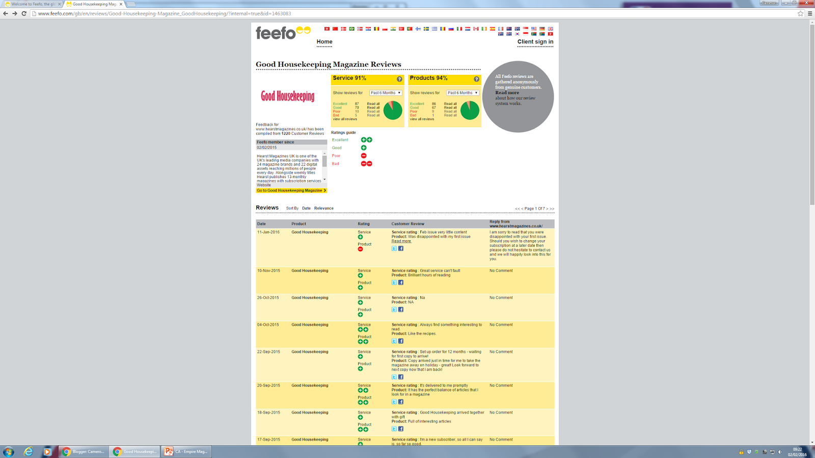
(Image from)
Fefo is an online site that audiences of specific products can leave reviews to which are then passed on to the producers of the magazine. The site has a series of different partnerships but for this instance we will look at Good Housekeeping a women's magazine owned by Hearst Corporation which focus's on recipes, diet and health. Each review has a written review, a rating for the service and product and then a comment back from Good Housekeeping. Overall on this site there has been 87 Excellent Reviews, 70 Good Reviews, 10 Poor Reviews and 5 Bad Reviews for the service. For the product itself it has a total of 86 Excellent reviews, 67 Good reviews, 9 Poor Reviews and one Bad review. This is a grand total for over 6 months.
Ideally, the producers of the magazine would like a full excellent review across the board. Yet this isn't always the case as you can't please everyone. By looking the reviews the producer can create a list of recurring issues and then discuss them with those high up in the company to suggest change. For instance one review rates it a poor product as "Feb issue very little content". For instance this change could have Good Housekeeping looking through the issue and comparing it to previous issues to review if their was enough content. In order to fix it for next time they will then make sure there is a enough content for the Match Edition. This review was left on the 11th of January 2016.
Yet on the other side of things there is reviews that featured all excellent in their rating and overall the consumer found that "There is always something interesting to read" and they "like the recipes" This suggests to the producer that they is no changes needed from their review, which may not always be the case. In terms of making changes from the reviews, the producer must look at each review as part as an overall picture and see if the majority think a change is needed. Once the producer has taken the reviews into account they can then decide what needs changing. Here are some more great examples of reviews:
| Review of | Rating | Customer Review |
|---|---|---|
Good Housekeeping | I am very happy with the magazine and I especially like the articles on fashion and the personal articles. I am not as interested in the products or make up items or the latest gadgets etc. |
Although they have given it an excellent rating, they still leave a note for the producers to take into account such as the make up. Yet the audience knows that all the features of the magazine aren't needed to make them a happy reader. And for my final example of a review lets take a look at a poor review:
| Review of | Rating | Customer Review |
|---|---|---|
Good Housekeeping | Very disappointing! Nothing like it used to be, too many adverts, too much fashion, not much information. |
From the review it is clear that it is an old reader coming back to try the product. They are very disappointed in the way the magazine has changed to include more adverts and too much fashion and again another comment on the lack of information has occurred. So far this has cropped up in 2 out of 25 reviews on one page of results. If this appeared in a total of 20 reviews out of 25 then an change would be planned instantly. However, with the majority happy with the product it is unlikely Good Housekeeping will change their current formula.
Complaints
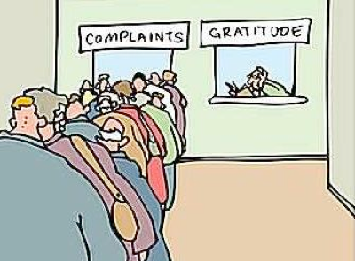
(Image from)
The last type of audience feedback is a complaint. Unlike a review which aims to describe the overall experience. A complaint is highlighting a negative aspect to the company so that is can be changed for future issues. The most common type of complaint is a accuracy review (false information) or a genuine mistake. If any magazine has a serious complaint then it will be handled by the IPSO who is the regulatory body for magazines. In general a complaint is to make sure the magazine has high standards of correct content and follows spelling, grammar and punctuation.

(Image from)
For instance if you were to complain to Empire you would go to the following website: http://www.bauermediacomplaints.co.uk/. Bauer media take "all complaints about editorial content seriously and are committed to abiding by the Independent Press Standards Organisation. This highlights that if the complaint is common to the IPSO the magazine will be under investigation as it may of broken regulatory laws. This then helps the producer alter their content so it is no longer breaking the rules of the IPSO and that its future content is suitable for all audiences. Meaning the audience feedback is very valuable. I will now look at the complaints procedure for Empire magazine.
First of all, you must clearly state that your complaint is a formal complaint that follows the policy at the complaints website. The policy does not cover: complaints about TV and radio, complaints about adverts (see the ASA and my previous blog from Understanding media for this), complaints about taste and decency, complaints about books, complaints about user content (I.E fan letters) and any complaint not covered by the IPSO. In order to complain you must:
-
Complaints should be made in writing, either by email to complaints@bauermedia.co.uk or by post to Bauer Consumer Media Limited, Endeavour House, 189 Shaftesbury Avenue, WC2H 8JG and addressed to The General Counsel.
-
complaints under this policy will only be accepted within four months from the date of the behaviour or first publication of the article that you are complaining about. Where an article remains accessible on our website, complaints will be accepted up to 12 months from the date of the behaviour or first publication of the article that you are complaining about.
-
When making your complaint you must include:
-
a copy of the article in question, or a link to the relevant webpage or a web address if the complaint is about published material (or reference to the publication title, issue date, page and article title if a copy is unavailable);
-
a written explanation of your concerns, with reference to the Editors' Code;
-
any other documents that will help us assess your complaint.
For complaints in accuracy (I.E if Empire had said that the Hunger Games features Emma Watson and it didn't) or mistakes use the email, for complaints that the magazine has broken the editors code then you must contact the IPSO.The IPSO will then consider the complaints by anyone personally affected. The IPSO have the right to reject a complaint on the grounds that it does not breach the Editor's code. If Bauer media receives multiple complaints about the same topic then they will respond to them all as one response, if they don't do this within 28 days then you are recommended to speak to the IPSO. Now that we have looked at the overall procedure lets take a quick glance at the editors code for the IPSO.
There is a total of 16 sections to the code:
1 Accuracy: In summary all information must be accurate and must take care to not mislead. Any mistakes should be corrected (For instance Empire state Deadpool is an 18 when it fact is a 15 and a reader writes in with this information. Empire must then make a change to be featured in next issue). Facts and opinion must clearly be separated (For instance the facts in Top Gear magazine are often stated in a short write up yet opinions come into the mix when the Trio write their articles to go in the magazine).
 (Image from)
2 Privacy: Everyone is entitled to privacy. All content should have permission. For instance if Empire had photographs of actors on set then they would need to get permission of the Film crews. (Even though Empire and other magazines are often invited to sets it is a good example).
3 Harassment: Journalists must not engage in pestering and harassing those who do not wish to contribute. Again take Empire as example they will often set up interviews. You do find out the latest news by reading an article about a reporter stalking Johnny Depp. A professional interview is arranged.
4 Intrusion into grief: This means at a time of grief do not approach the members involved.
5: Reporting suicide: No not include the details of how they did so. For instance when Heath Ledger died Empire would of created a tribute to the actor and would not of held details to his death. Instead celebrating his life. This prevents users reading content and getting ideas on how to commit suicide.
 (Image from)
6 Children: Children should be able to complete time at school without being interrupted, they cannot be approached at school, a parent must be present for interviews and a child's private life must not be published. Again, this mainly appeals to Empire if you have an interview with a child actor then you must have a parent present to make sure they are not misled into trick questioning.
7 Children in sex cases: Must not be identified and implied relationships must not be included. This is not needed for Empire and Top Gear much like the following sections: reporting crime, victims of sexual assault, finical journalism, witnesses' to crime and payment to criminals.
The other sections left are 12 discrimination: The press must avoid prejudice to race, color, sex,gender, identity or any other parts of a individual. For instance if Empire was to related on the Oscars boycott then they must not include personal opinions to avoid coming across the section of discrimination they must simply state the facts as it is a delicate manner that is currently in the lime light.
And finally journalists must have a sense to protect Confidential Sources (14). Top Gear must keep all information about new and upcoming cars secret until they are allowed to write and talk about them and so must Empire. They may know of new films coming out that must be kept confidential until a set time under the Non Disclosure act. If audiences complain then Bauer media can make sure that their product not only has quality content but also that it follows the IPSO to prevent it from breaking the regulations. It also means the audiences can help shape a quality product. In order to complain to Top Gear: Immediate media has provided the following contact details:
Complaints
(Image from)
(Image from)
For instance if you were to complain to Empire you would go to the following website: http://www.bauermediacomplaints.co.uk/. Bauer media take "all complaints about editorial content seriously and are committed to abiding by the Independent Press Standards Organisation. This highlights that if the complaint is common to the IPSO the magazine will be under investigation as it may of broken regulatory laws. This then helps the producer alter their content so it is no longer breaking the rules of the IPSO and that its future content is suitable for all audiences. Meaning the audience feedback is very valuable. I will now look at the complaints procedure for Empire magazine.
First of all, you must clearly state that your complaint is a formal complaint that follows the policy at the complaints website. The policy does not cover: complaints about TV and radio, complaints about adverts (see the ASA and my previous blog from Understanding media for this), complaints about taste and decency, complaints about books, complaints about user content (I.E fan letters) and any complaint not covered by the IPSO. In order to complain you must:
- Complaints should be made in writing, either by email to complaints@bauermedia.co.uk or by post to Bauer Consumer Media Limited, Endeavour House, 189 Shaftesbury Avenue, WC2H 8JG and addressed to The General Counsel.
- complaints under this policy will only be accepted within four months from the date of the behaviour or first publication of the article that you are complaining about. Where an article remains accessible on our website, complaints will be accepted up to 12 months from the date of the behaviour or first publication of the article that you are complaining about.
- When making your complaint you must include:
- a copy of the article in question, or a link to the relevant webpage or a web address if the complaint is about published material (or reference to the publication title, issue date, page and article title if a copy is unavailable);
- a written explanation of your concerns, with reference to the Editors' Code;
- any other documents that will help us assess your complaint.
For complaints in accuracy (I.E if Empire had said that the Hunger Games features Emma Watson and it didn't) or mistakes use the email, for complaints that the magazine has broken the editors code then you must contact the IPSO.The IPSO will then consider the complaints by anyone personally affected. The IPSO have the right to reject a complaint on the grounds that it does not breach the Editor's code. If Bauer media receives multiple complaints about the same topic then they will respond to them all as one response, if they don't do this within 28 days then you are recommended to speak to the IPSO. Now that we have looked at the overall procedure lets take a quick glance at the editors code for the IPSO.
There is a total of 16 sections to the code:
1 Accuracy: In summary all information must be accurate and must take care to not mislead. Any mistakes should be corrected (For instance Empire state Deadpool is an 18 when it fact is a 15 and a reader writes in with this information. Empire must then make a change to be featured in next issue). Facts and opinion must clearly be separated (For instance the facts in Top Gear magazine are often stated in a short write up yet opinions come into the mix when the Trio write their articles to go in the magazine).
(Image from)
2 Privacy: Everyone is entitled to privacy. All content should have permission. For instance if Empire had photographs of actors on set then they would need to get permission of the Film crews. (Even though Empire and other magazines are often invited to sets it is a good example).
3 Harassment: Journalists must not engage in pestering and harassing those who do not wish to contribute. Again take Empire as example they will often set up interviews. You do find out the latest news by reading an article about a reporter stalking Johnny Depp. A professional interview is arranged.
4 Intrusion into grief: This means at a time of grief do not approach the members involved.
5: Reporting suicide: No not include the details of how they did so. For instance when Heath Ledger died Empire would of created a tribute to the actor and would not of held details to his death. Instead celebrating his life. This prevents users reading content and getting ideas on how to commit suicide.
(Image from)
6 Children: Children should be able to complete time at school without being interrupted, they cannot be approached at school, a parent must be present for interviews and a child's private life must not be published. Again, this mainly appeals to Empire if you have an interview with a child actor then you must have a parent present to make sure they are not misled into trick questioning.
7 Children in sex cases: Must not be identified and implied relationships must not be included. This is not needed for Empire and Top Gear much like the following sections: reporting crime, victims of sexual assault, finical journalism, witnesses' to crime and payment to criminals.
The other sections left are 12 discrimination: The press must avoid prejudice to race, color, sex,gender, identity or any other parts of a individual. For instance if Empire was to related on the Oscars boycott then they must not include personal opinions to avoid coming across the section of discrimination they must simply state the facts as it is a delicate manner that is currently in the lime light.
And finally journalists must have a sense to protect Confidential Sources (14). Top Gear must keep all information about new and upcoming cars secret until they are allowed to write and talk about them and so must Empire. They may know of new films coming out that must be kept confidential until a set time under the Non Disclosure act. If audiences complain then Bauer media can make sure that their product not only has quality content but also that it follows the IPSO to prevent it from breaking the regulations. It also means the audiences can help shape a quality product. In order to complain to Top Gear: Immediate media has provided the following contact details:
TOP GEAR MAGAZINE
General enquiries:
By email/telephone: Queries@immediate.co.uk or call 02071505558
Letters page:
letters@bbctopgearmagazine.com or write to Top Gear Magazine, Second Floor A, Energy Centre, Media Centre, 201 Wood Lane, W12 7TQ
Magazine advertising:
Contact Sam Field at sam.field@immediate.co.uk
You can also approach the IPSO following the same model as Bauer Media. This concludes the end of how audience feedback can help producers effect the change of a product but also the end of the assignment.